Colour is not merely decorative. It is physiological.
Long before you consciously register the painting on your wall, your nervous system has already responded to it. The colour you live with every day — in your bedroom, your kitchen, your workspace — shapes your mood, your energy levels, and even your cognitive performance. This is not aesthetic opinion. It is documented science.
Understanding how colour works in abstract art gives you a genuinely powerful tool for designing spaces that feel the way you want them to feel.

The science
Colour perception begins in the eye but is processed in the brain. Different wavelengths of light trigger different neural responses. Red wavelengths stimulate the sympathetic nervous system — increasing heart rate and alertness. Blue wavelengths have the opposite effect, activating the parasympathetic system and promoting calm. Greens, sitting at the centre of the visible spectrum, require the least cognitive effort to process — which is why time spent in nature feels effortless.
These are not individual responses. They are broadly consistent across populations. The cultural associations around colour (red for danger, green for growth) emerged partly because they align with these biological realities.

Why abstract art amplifies colour effects
In representational art, colour is partially subordinated to subject. A portrait may use cool blues, but your eye and brain are processing a face — the subject is the point.
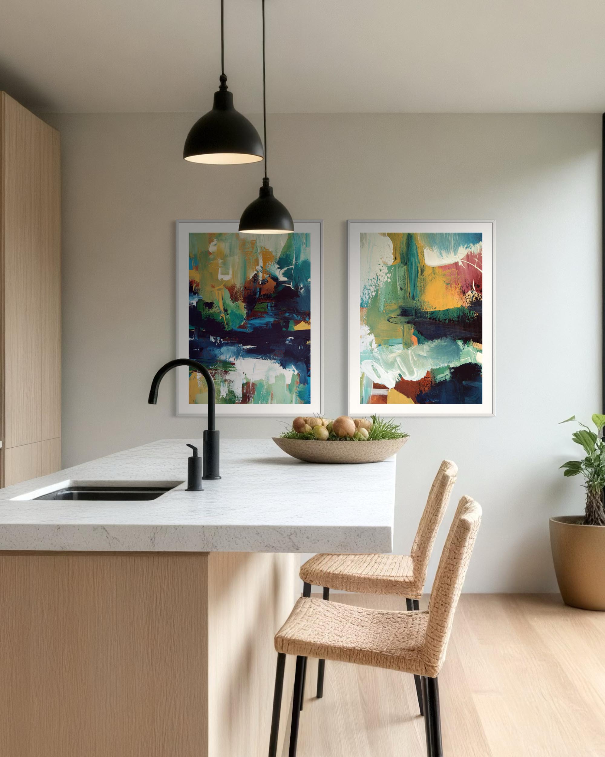
In abstract art, colour is the subject. Without narrative to anchor your attention, the eye dwells in the colour field itself. This makes abstract art a particularly direct conduit for colour's psychological effects. A large abstract in deep cobalt blue is not simply a blue picture — it is a sustained blue experience, delivered at scale to your nervous system every time you enter the room.

What this means for how you choose art
The colours in your paintings should not be chosen to match your sofa. They should be chosen to match the emotional function of the room.
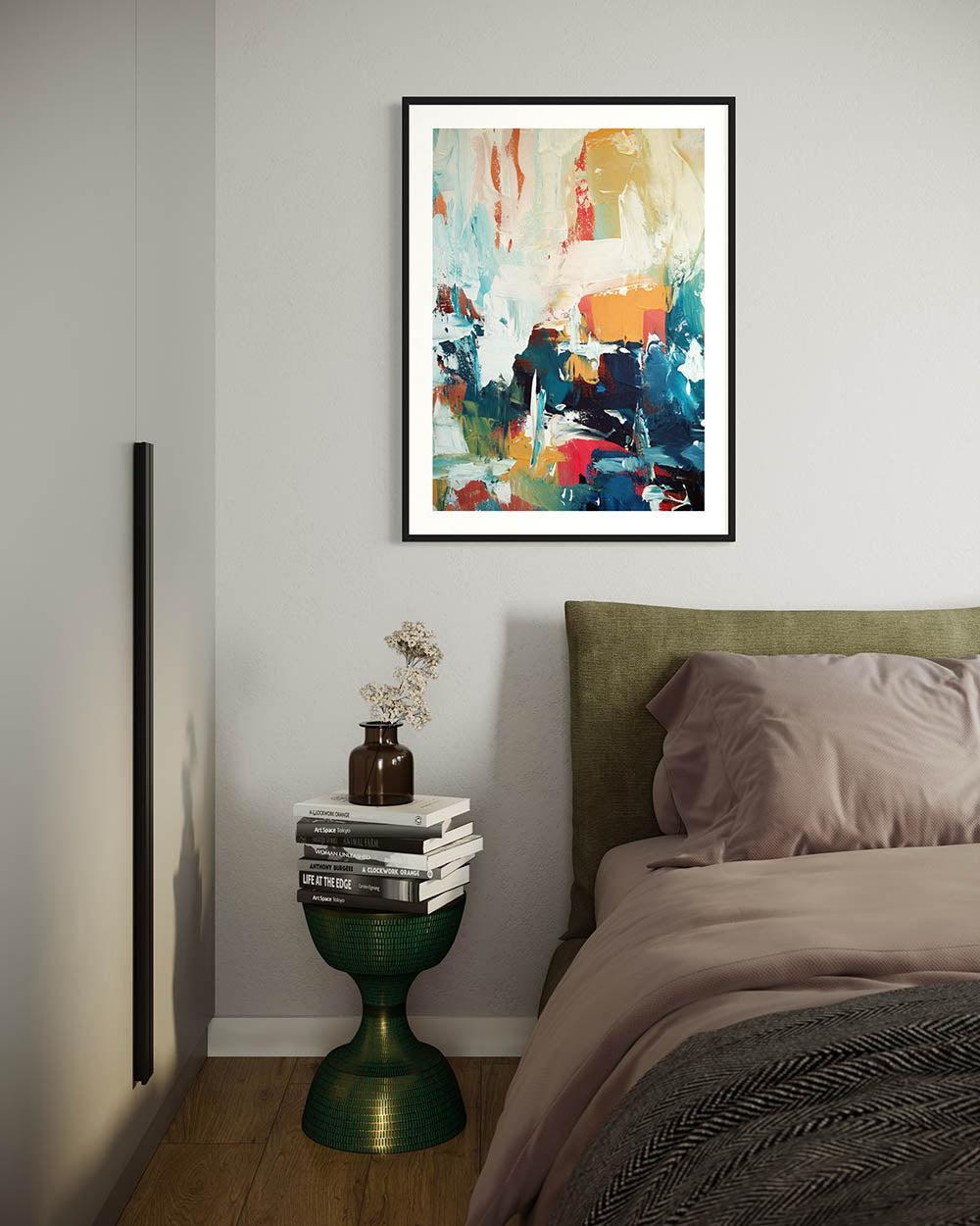
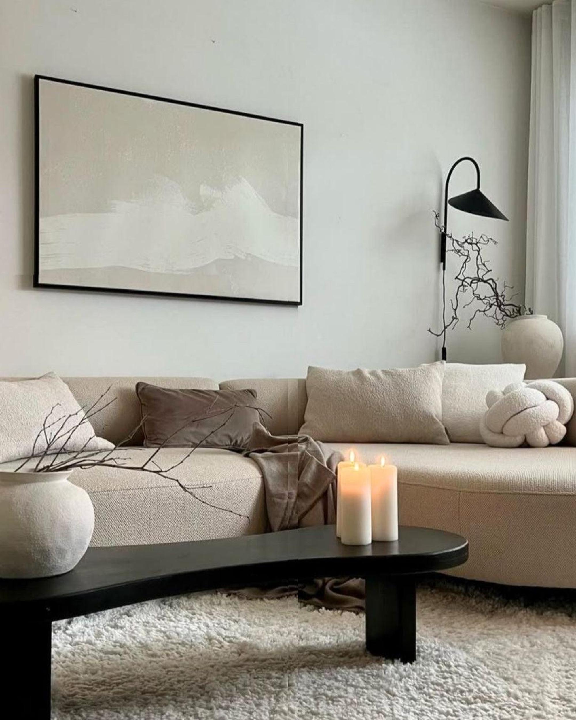
A bedroom is for rest. The art on its walls should support that. Deep, desaturated blues; warm, muted neutrals; soft sage greens — these create an environment that the body interprets as safe and calm. Harsh, energising colours work against the purpose of the space.
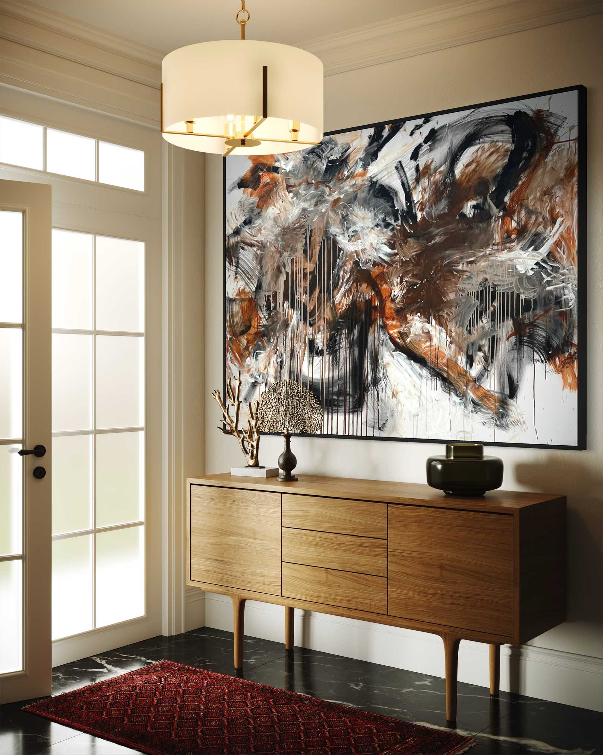
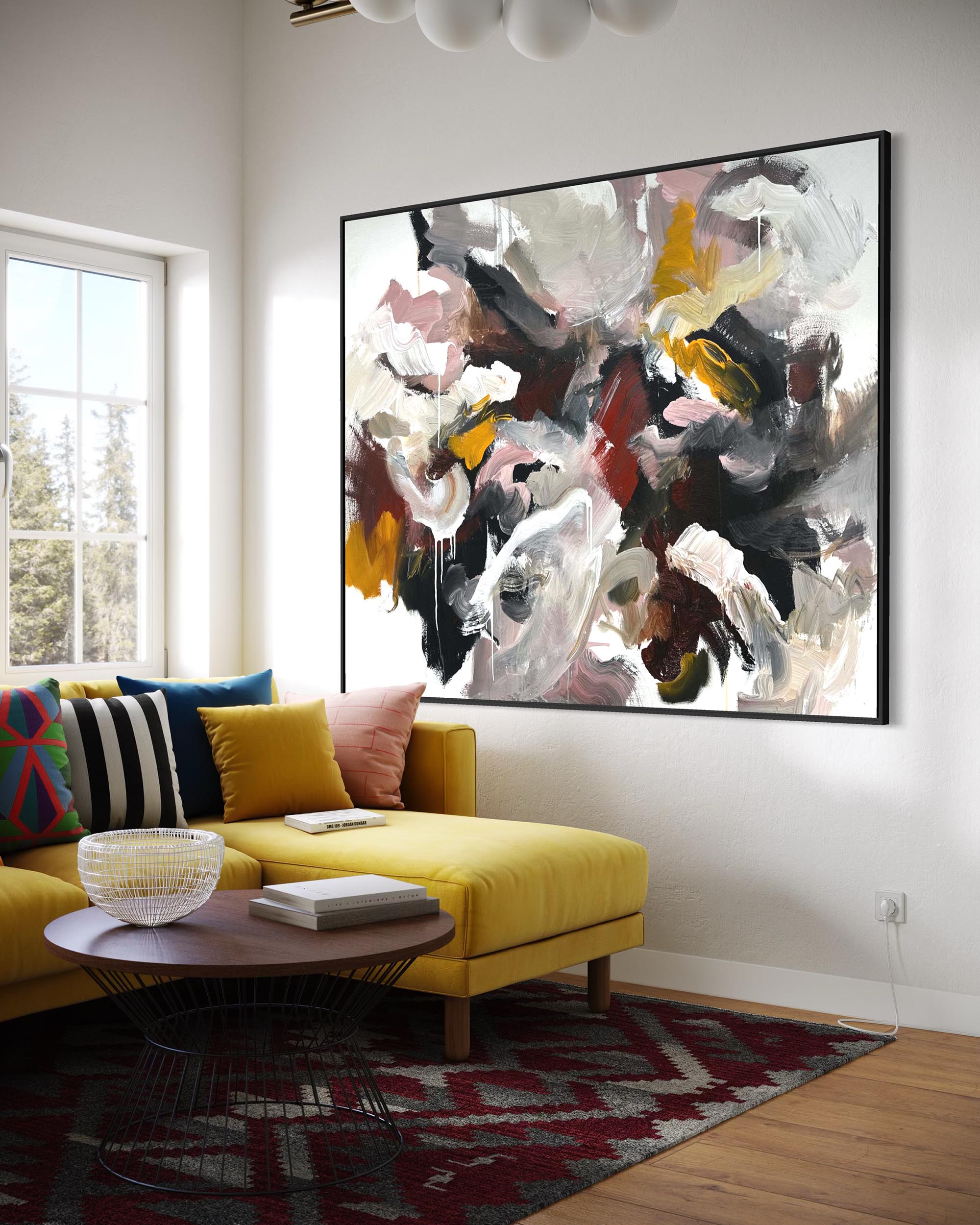
A living room is for connection and expression. Here, you have permission to be bolder. Warm ochres, terracotta, earthy reds — these are colours that promote sociability and warmth. The right abstract painting becomes the conversation rather than the backdrop.
A home office is for focus and creativity. Research published in the British Journal of Psychology found that exposure to blue environments enhances creative output, while red environments improve attention to detail. Depending on the nature of your work, the colour on your walls can become a practical tool.
The deeper point
The art you live with is not passive. It is an active participant in your daily experience. Choosing it with intentionality — understanding not just what you like to look at, but what you need to feel — is one of the most considered things you can do for your space.