Here's what happened when we brought an eclectic mix of colour into a Central London corporate office.
Workplaces are changing. We're well-versed on the fact that office managers and commercial designers are tasked with making an office space feel like home. However, there's a quiet crisis happening inside British workplaces. It's not so much in the P&L or the headcount spreadsheet. It's happening on the walls.
When you look at commercial design in London, the city has increased its investment in FFE and design in recent years. According to Savills research, the largest transaction in 2025 was Ellison Institute of Technology acquiring the western side of Oxford Science Park for £890 million. This landmark deal represented the largest commercial transaction in the past five years across the regional office investment market. The only other deal which reached in excess of £100 million was when McLaren bought their campus in Woking for £250 million. Office designers and stakeholders understand investment in workspace design is critical to creating not just a corporate culture that reflects its investment in people, but also the wellbeing of staff while encouraging them back to site. These are the factors that can make or break a deal to attract new talent to drive a business forward into its next stage of growth.

What used to be traditional office space with the occasional motivational poster in a clip frame and a rubber plant sitting under fluorescent light, fortunately is no longer the norm. You can't have office floors that require accountability, but with walls that say nothing at all.
According to Gallup's 2024 State of the Global Workplace report, only 10% of UK employees are actively engaged at work. The physical environment isn't the only culprit, of course. But it's one lever we chronically underestimate, and one of the easiest factors to change.
We're here to talk about colour, not as decoration. As strategy.

Your Brain on Colour: The Science Behind the Palette
Colour psychology isn't soft science. It's rooted in neuroscience, environmental psychology, and decades of behavioural research.
In summary, colour affects mood, cortisol levels, cognitive performance, and even perception of time. Different hues trigger measurably different neurological responses, and those responses have direct implications for how people work.
Here's just a snippet of some of the colours that we're seeing in office spaces and how they can impact the working environment.
-
Blue, in particular mid-range blue tones, are consistently associated with enhanced focus and calmer cognitive processing. Research published in Science journal found that blue environments boosted performance on tasks requiring creative ideation. It's why it dominates tech and finance interiors. But over-reliance on cool blue creates emotional distance, something that designers call 'institutional coldness'.
-
Yellow activates the nervous system and promotes optimism. Perceived as the colour of sunlight, in small doses, it lifts energy and stimulates conversation. If overdone, yellow can induce anxiety. It's the espresso of the colour spectrum: transformative in the right measure, overwhelming in quantity.
-
Green is the most physiologically neutral colour for the human eye, requiring minimal adjustment from the lens. Studies consistently link green environments to reduced stress and restored attention, particularly relevant in deep-focus work zones or spaces designed for recovery.
-
Red elevates the heart rate, increases urgency, and sharpens short-burst concentration. It's associated with motivation and physical energy. Used strategically in circulation routes, reception areas, or collaborative zones, it creates dynamism. If a scheme features too much red, it can raise aggression and fatigue.
-
Orange is the under-utilised middle ground: bringing energy without the aggression of red, while warm without yellow's anxiety. Research from the University of Texas found that both orange and yellow workplaces outperformed white and beige ones in terms of reported mood and productivity perception.
So, what's the key insight here? There is no single productive colour. The question we always focus on is: what are people doing here, and what emotional state best serves that work?
Colour as Zoning: A Framework for Intentional Spaces
The most sophisticated workplace environments don't apply one palette. They use colour as a zoning tool, to create distinctive psychological micro-climates within the same floor plan.
Think of it in three categories:
-
Focus zones: Areas for deep work, solo concentration and analytical tasks benefit from low-stimulus environments. Best colours: cool blues, muted greens, soft greys. Minimal contrast. Colour that recedes and lets the mind move inward.
-
Collaboration zones: Spaces designed for idea generation, team collaboration and creative briefs call for energised, stimulating environments. Best colours: warm saturated tones, textural contrast, unexpected colour pairings. Environments that signal permission to think out loud.
-
Recovery zones: Office break-out areas, coffee points and transitional corridors are perhaps the most overlooked. These are the spaces where the nervous system pauses, giving that short time to decompress and reenergise. Best colours: biophilic greens and warm, earthy tones. The colour of relaxation.
When these zones are considered intentionally, something remarkable happens: the building itself begins to regulate the workday. People move through spaces that prime them for what comes next. The architecture does cognitive work before the employee sits down.
Art as Activation: Why Paintings And Fine Art Prints Outperform Paint Alone
Paint moves the baseline. Art moves the person.
There's an important distinction here. A teal accent wall shifts the ambient emotional tone of a room. A large-scale original painting or carefully curated fine art print creates a point of focus, generates conversation, invites interpretation, and signals that this organisation values beauty as part of its culture.

In a 2010 study by Dr. Craig Knight at the University of Exeter, workers in enriched spaces, those decorated with art and plants, were 17% more productive than those in lean, minimal spaces. Workers given scope over their own decorative choices were 32% more productive. The conclusion is striking: art in the workplace isn't a luxury add-on. It's a performance variable.
Beyond productivity, there's a less-measured but deeply felt cultural dimension. The art an organisation chooses to display communicates its brand values, its tolerance for risk, its relationship with creativity. A company that hangs bold, original work is making a statement about how it sees itself, and employees notice.

Case Study: The Farringdon Project
A Central London corporate office in the financial services sector, 50+ person team, occupying a modern glass office building in Farringdon.
The Brief
The client came to us with a problem that many growing businesses recognise: they needed identity which their original fit-out was missing. What had felt fresh and intentional four years ago now felt like a waiting room. Staff turnover had ticked up, and post-pandemic hybrid working had made the office feel emptier than its Board wanted. Leadership wanted the space to earn its commute and to be a place people chose to come to, not merely tolerated within their contractual obligations.
Their brief was, in their words, "eclectic but serious. Colour without chaos. Something that feels like us, not like a design agency trying to be us."
The Approach
We began not with a moodboard but with a conversation. Who are your people? What does a great day look like here? Where does energy fall in this building?
The answers were consistent: energy levels were reduced in the corridor between the lift lobby and the main floor. The reception felt unwelcoming. The boardroom made people feel like they were being assessed. The open-plan desk floor was too uniform to be interesting and too busy to be calm.
Four zones, four distinct interventions.
The Corridor: First Impression as Statement
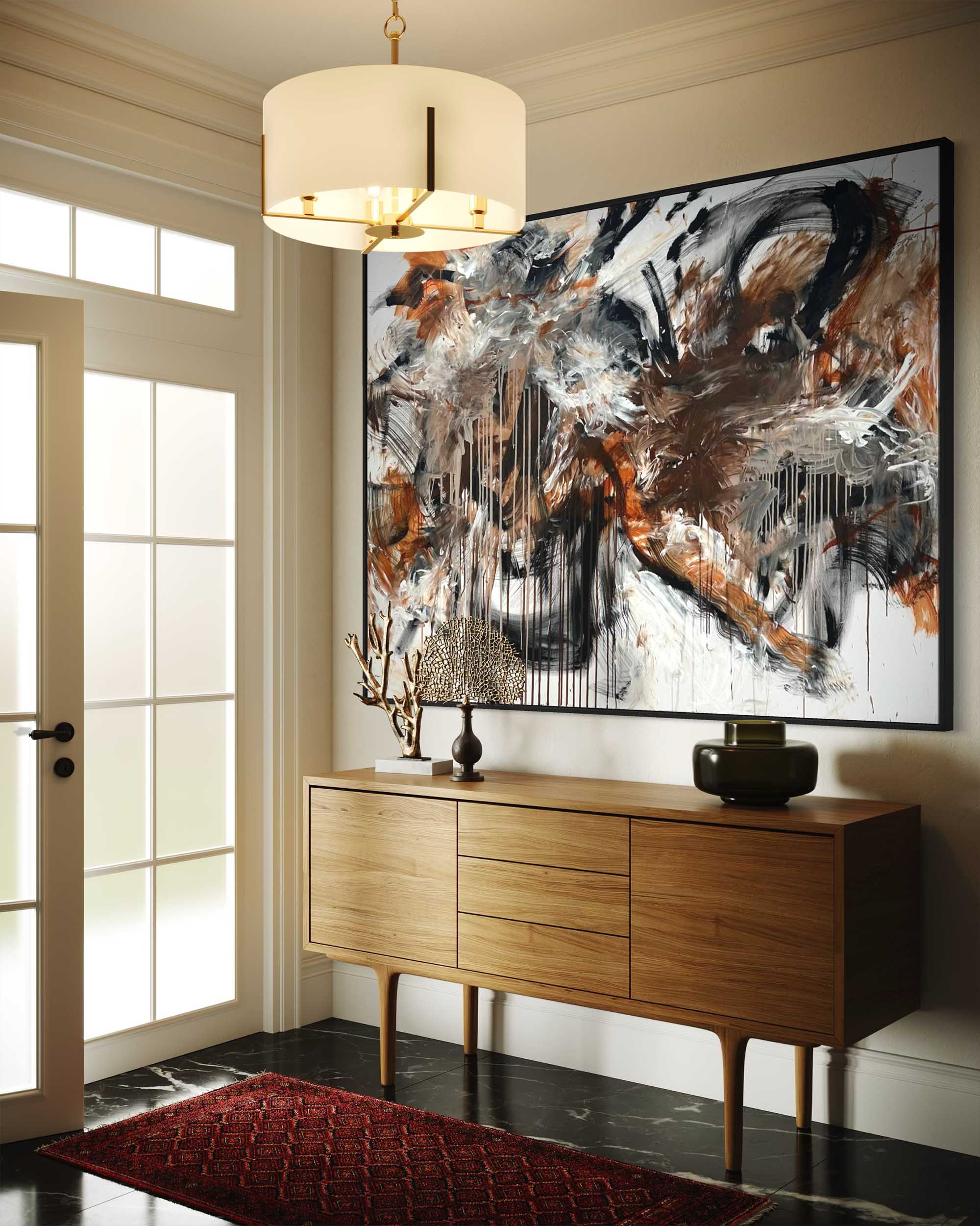
 Photo Credit: Photo Supplied By Client For Central London Project
We treated the entry corridor as an editorial moment — the first sentence of the building's story. A deep rust-orange on the left wall, paired with three large-format abstract prints. Works with raw texture, layered pigment, marks that suggest energy and process. The effect is immediate: you enter and the building wakes up. The orange is warm without being aggressive; the abstracts give the eye somewhere to travel. Heart rate lifts slightly. You feel something. That's the point.
The Reception: The First Impression
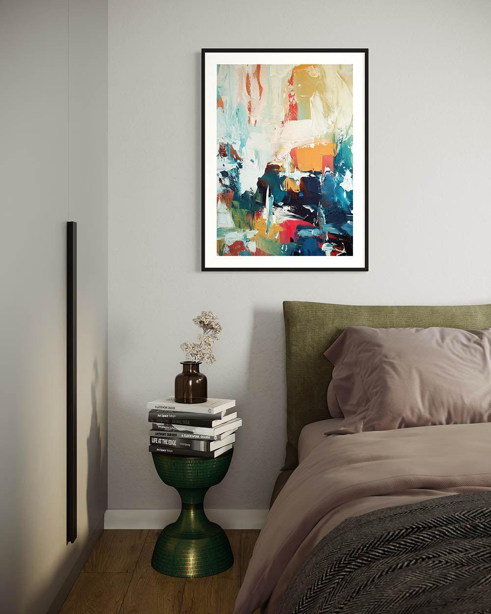
The reception was painted in a deep navy blue — not a corporate blue, but a genuine, bold blue selected to make a statement in this modern office space. We introduced an original botanical inspired painting, hand-painted in acrylic paint. This was created to anchor the space and create that energetic, impressive first statement to prospective clients and staff.

Behind the reception desk, two of our modern large abstract fine art prints were hung to bring a cohesive theme to the space. The result was the most commented-on change in the entire project. Employees were proud to call this workspace their own, because it felt worth coming into this modern, soulful space.

The Office Floor: Authority Without Intimidation
The office floor was the hardest brief. It needed gravity — this is where teams and the board sit. But it had been oppressive: dark wood, a vast table, no art, a whiteboard that dominated an entire wall.

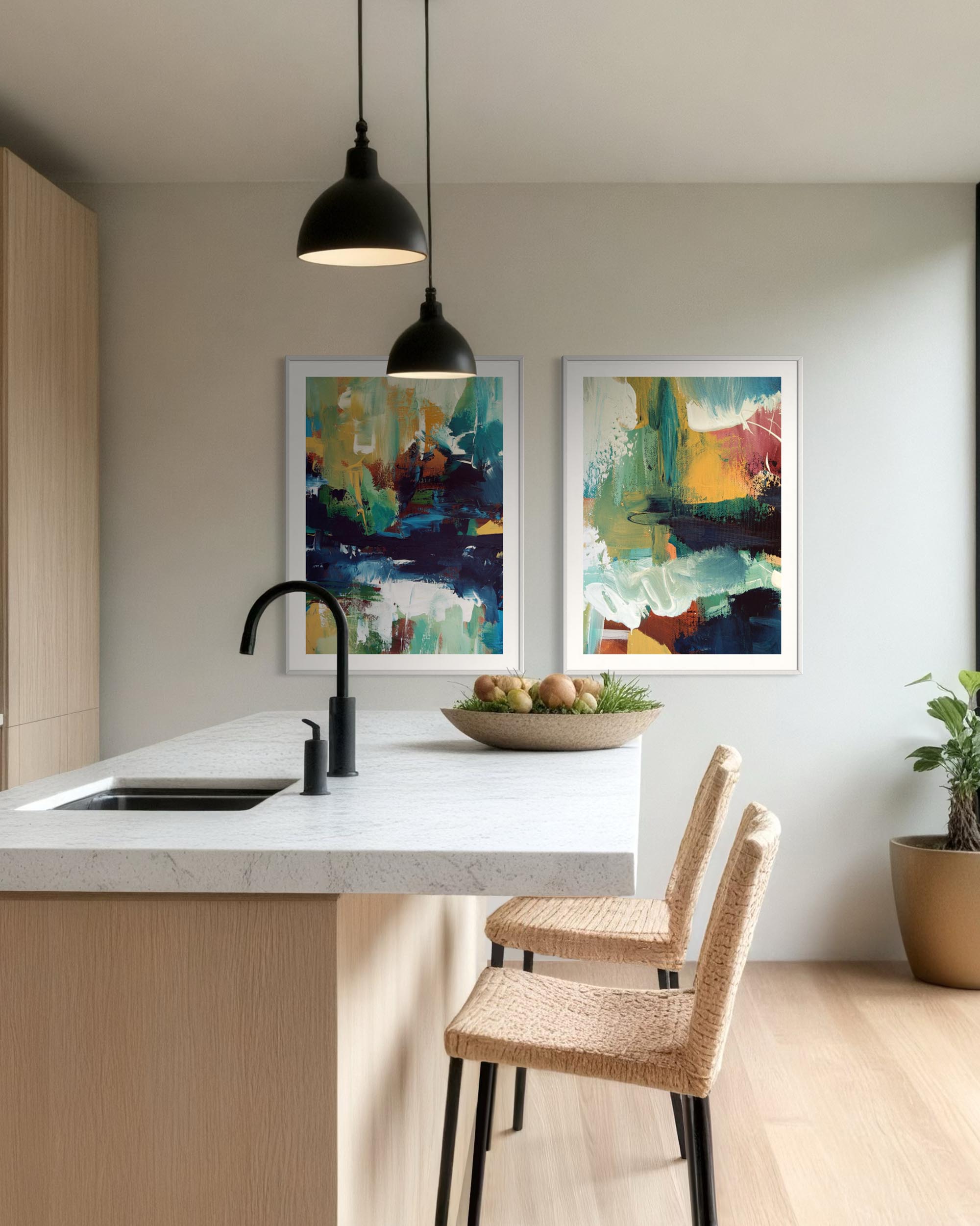
Photo Credit: Original art and fine art prints pictured in the office open plan floor
We introduced a single large-scale original painting from our expressionist series. Featuring a mixed palette of blue, white with pops of pink and yellow ochre, this piece made such a statement against a neutral wall. Hung alongside a series of colourful geometric and abstract fine art prints, multiple clients have commented on it since the project was installed.
The Open Floor: Colour Without Noise

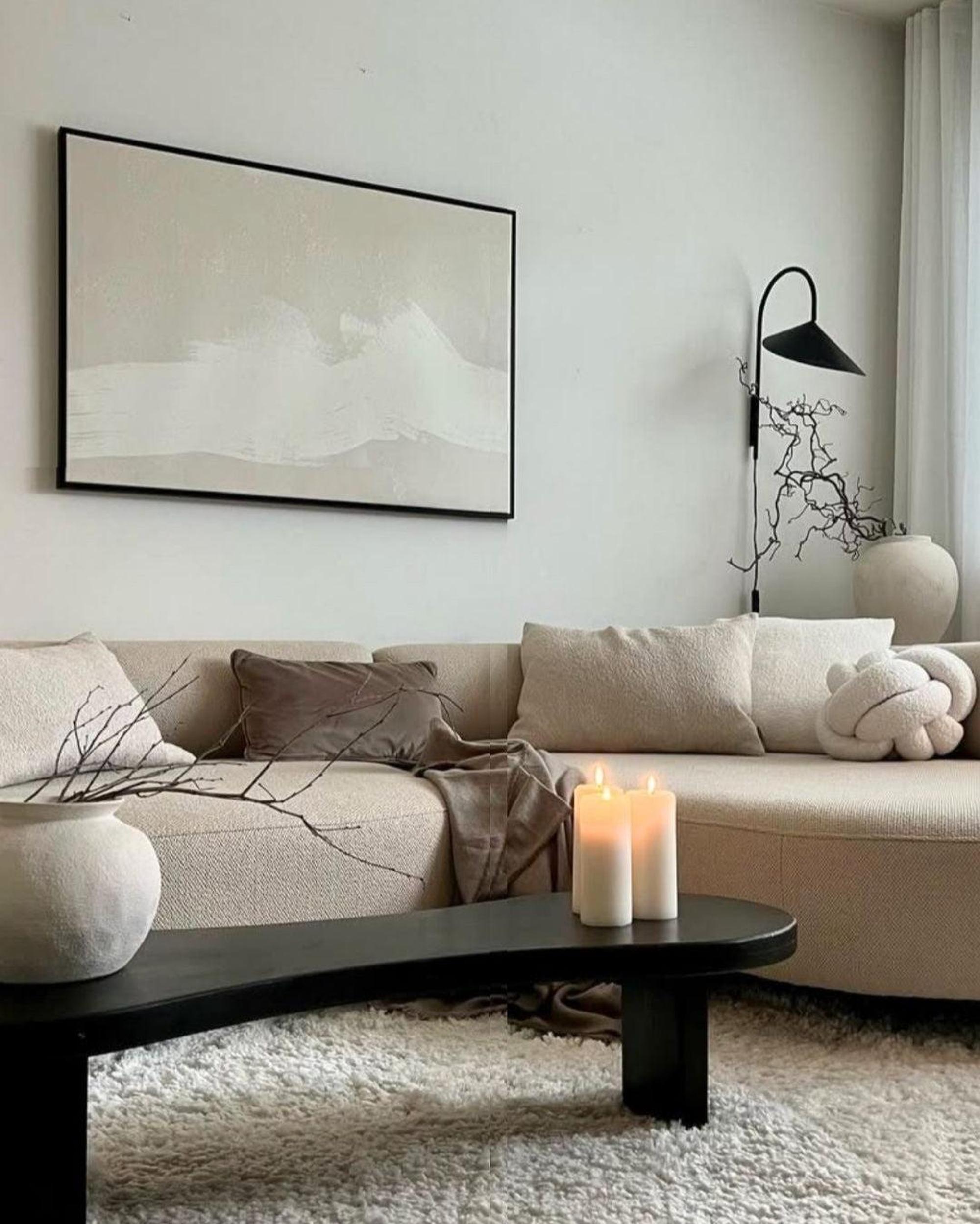
Photo Credit: Original art and fine art prints pictured in the office open plan floor
The desk floor presented the most complex challenge: 40 workstations with differing light levels across the space.
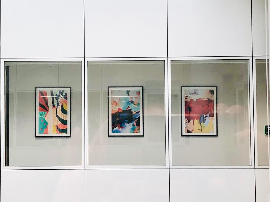
We introduced colour vertically through a series of medium-format prints installed along the perimeter walls. Works from our Contemporary Shapes collections, featuring organic forms, subtle blues and terracotta tones, representing soft movement. Colour that rewards peripheral vision without interrupting direct focus. A visual rhythm that makes the floor feel inhabited and considered.
The Outcome
Six months after installation, the client reported staff voluntary office attendance increased among hybrid workers, and they had positive unsolicited feedback from staff and visiting clients - a dramatic reduction in the "nothing to look at" complaint that had featured in their last internal staff survey.
One senior team member put it plainly in a follow-up call, "The office finally feels like it belongs to us."

That sentence is worth more than any metric to us.
What This Means for Your Workplace
If you're a leader, an operations director, or anyone responsible for the spaces where people spend their working lives, here is the most honest thing I can offer:
You cannot afford neutrality.
Beige is not a safe choice. It's an abdication. It says: we couldn't decide, or we didn't think it mattered. Your people hear that message, even if they can't articulate it.
The good news is that colour and art are among the most cost-effective interventions available. You don't need to refit an entire floor. You need intentionality. You need to ask what each space is for, what emotional state it should induce, and what that should look like on the wall.
Start with one room. Make it matter.

Photo Source: Modern Abstract Framed Prints For Commercial Workspace, Supplied By Client
Abstract House works with corporate clients across London and the UK to develop bespoke art programmes for workplace environments. We combine original paintings, limited edition fine art giclée prints, and expert colour consultation to create spaces that perform as well as they look. Trade enquiries and project briefs welcome.
Connect with us and follow Abstract House for more on art, interiors, and the science behind beautiful spaces.