In our latest paint colour trend guide, we're looking at Farrow & Ball's Wimborne White.
There are whites, and then there is Wimborne White. Farrow & Ball's No.239 has quietly become the most popular paint colour the British brand has ever produced, and once you understand what makes it special, it's not hard to see why. This is not the sharp, cold white of a hospital corridor or a flat-pack showroom. Wimborne White is something richer, warmer, and far more considered. It is the kind of white that makes a room feel loved.

Art: Time Flies original abstract painting.
What Makes Wimborne White Different
At first glance, Wimborne White reads as a soft, creamy off-white with a faint yellow warmth. Look a little closer, and you will notice it has real depth — a gentle complexity that shifts beautifully depending on the light. In rooms flooded with morning sun, it glows almost buttery. In north-facing spaces or under artificial light in the evenings, it pulls towards a softer, more muted ivory. That chameleon quality is exactly what makes it so universally flattering.
The undertones are predominantly warm: a whisper of yellow, the faintest trace of pink, sitting on a white base that never feels flat. Farrow & Ball achieves this through their famously high-pigment formulas, which give Wimborne White a chalky, powdery depth that standard trade paints simply cannot replicate. The result is a colour that feels layered and intentional rather than like a default choice.
 Art: Modern Collage Shapes Art Print, Collages Art Print.
The Psychology of Wimborne White
Colour psychologists consistently associate warm whites with comfort, calm, and openness. Unlike bright whites, which can feel clinical or energising in a way that inhibits rest, warm whites like Wimborne White invite you to slow down. They reflect light generously without dazzling, creating an atmosphere that feels both airy and enveloping at once.
It is the colour equivalent of a deep exhale. That is why it works so beautifully in spaces where you want to feel at ease — and why so many interior designers reach for it as a backdrop rather than a statement colour. Wimborne White does not demand attention. Instead, it creates the perfect conditions for everything else in a room — furniture, textiles, and art — to truly shine.

We Think You'll Love:
- The Best Farrow & Ball Paint Colours 2026
- Best Affordable Abstract Art To Buy Now
- How To Choose Large Statement Art For Your Living Room
- Transform Your House Into A Gallery

Art: Jungle Palms Canvas Art Print Set
Where to Use It
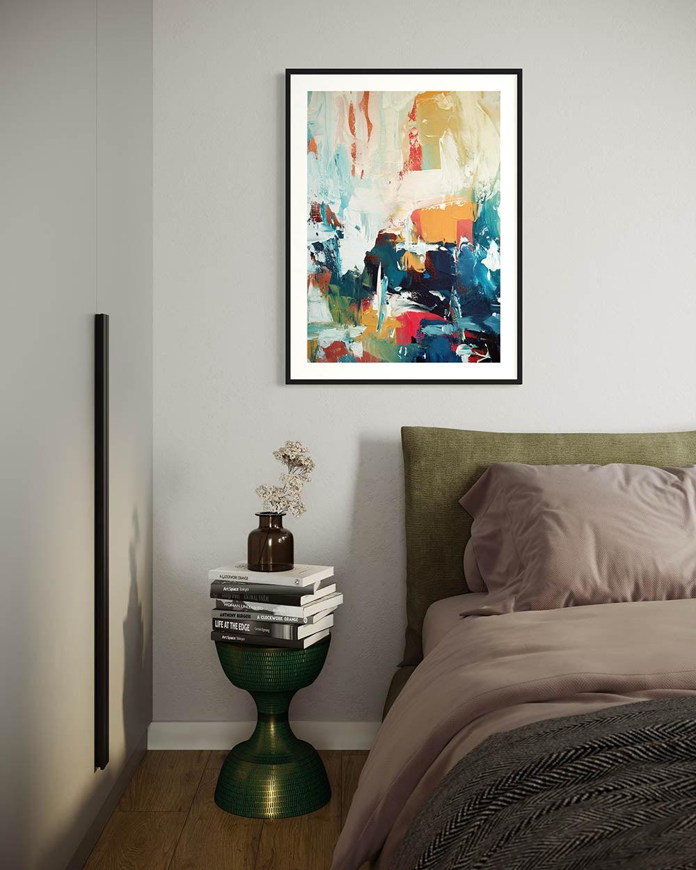
Bedrooms are where Wimborne White really comes into its own. The warm, hushed quality of the colour wraps a bedroom in exactly the kind of softness you want around you at night and in the morning. Paired with linen bedding in natural oatmeal tones, aged brass hardware, and loose-weave curtains, it creates a bedroom that feels genuinely restorative. Imagine waking up in a room that feels like it belongs in a boutique hotel in the south of France — that is the Wimborne White effect.
Bathrooms are another natural home for this colour. In a space that can so easily feel cold and utilitarian, Wimborne White brings warmth and softness without sacrificing the brightness a bathroom needs. It works brilliantly alongside natural stone tiles, warm-toned grout, and unlacquered brass taps. Add a single piece of framed art — a botanical print or an abstract in muted earth tones — and the room moves from functional to genuinely beautiful.
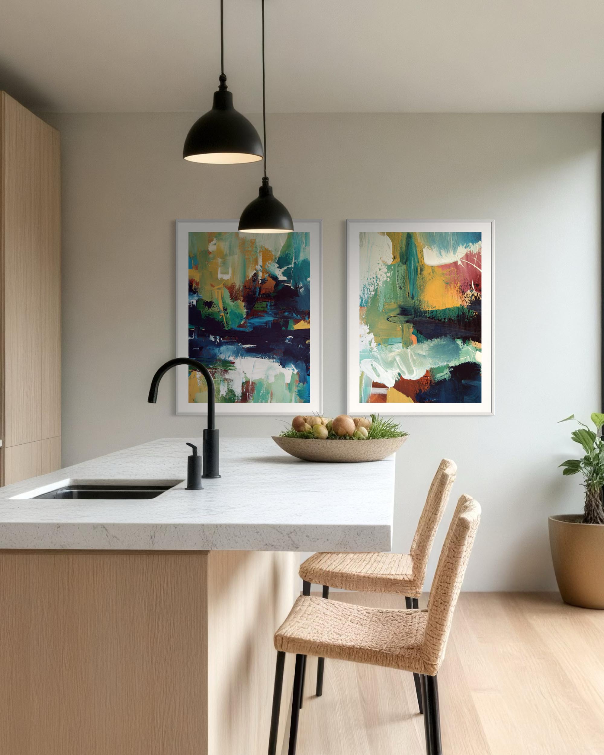
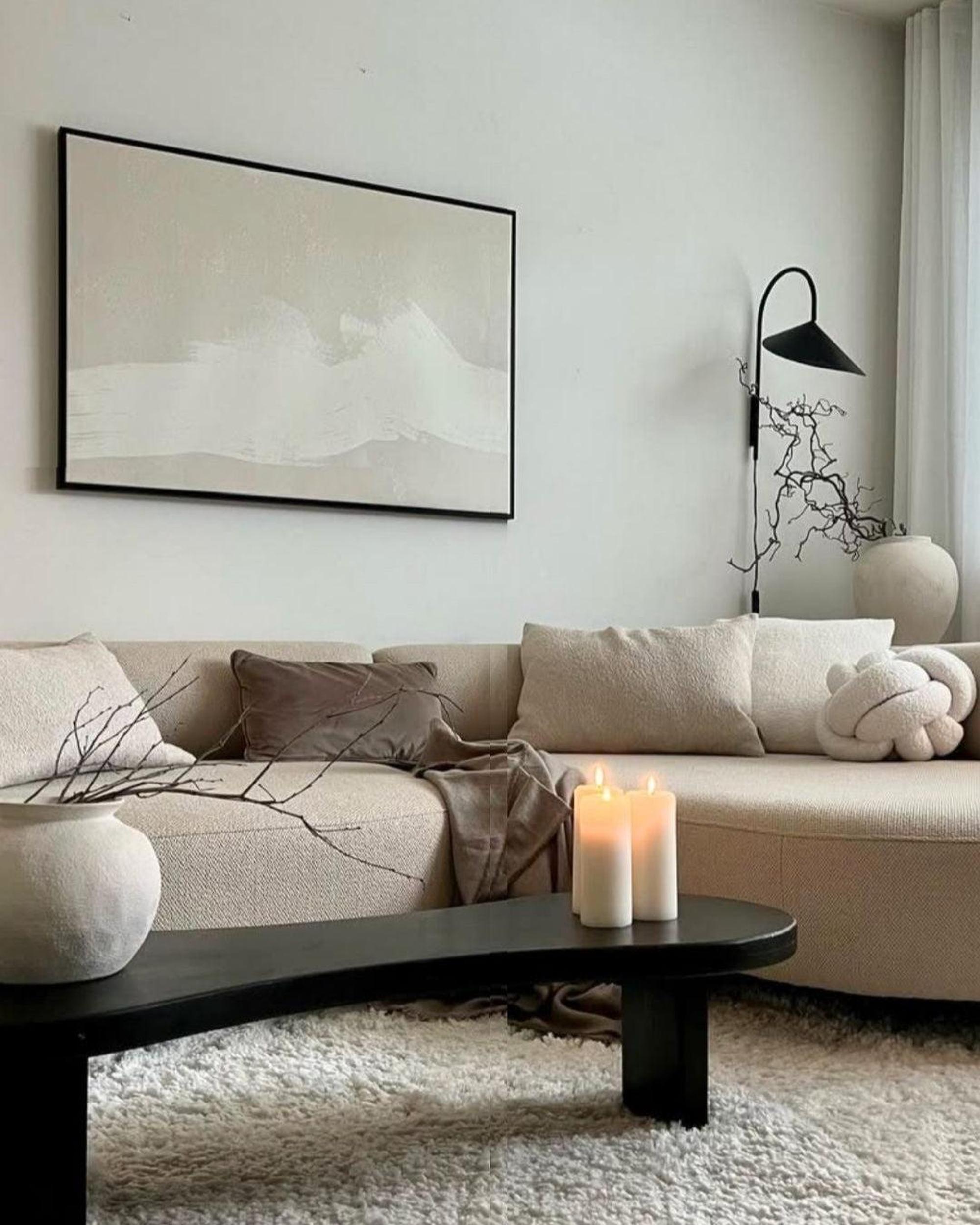
Living rooms and open-plan spaces benefit enormously from Wimborne White's ability to read differently across the day. It creates a unified, cohesive backdrop that allows furniture and art to breathe, while keeping the space from ever feeling stark. It also bridges the gap between warm and cool tones in a room, making it far easier to mix furniture styles and materials without the space feeling disjointed.
 Art: Raw Emotions Diptych Original Painting
Home offices and studies are an underrated application. A home office painted in Wimborne White feels calm and focused without the clinical edge of a bright white — exactly the right environment for clear thinking and creative work.
Pairing Wimborne White with Art: Our Curator's Picks
This is where Wimborne White becomes something truly special. Because the colour is warm but restrained, it creates an ideal canvas for art. It never competes. Instead, it elevates.
For bedrooms, our curators recommend pairing Wimborne White walls with soft abstract prints — think loose washes of dusty rose, terracotta, and warm sand. The warmth in the paint draws out the earthier tones in these works and creates a sense of harmony between wall and artwork that feels effortless. A single large-format original in muted tones, hung above the bed, turns the whole wall into a considered composition.
For bathrooms, botanical prints in sage green and cream feel perfectly at home against Wimborne White. The natural subject matter, the organic lines, and the restrained palette all echo the calm that the colour itself creates. Our recommendation is to frame them simply — a thin brass or natural oak frame lets the art lead.
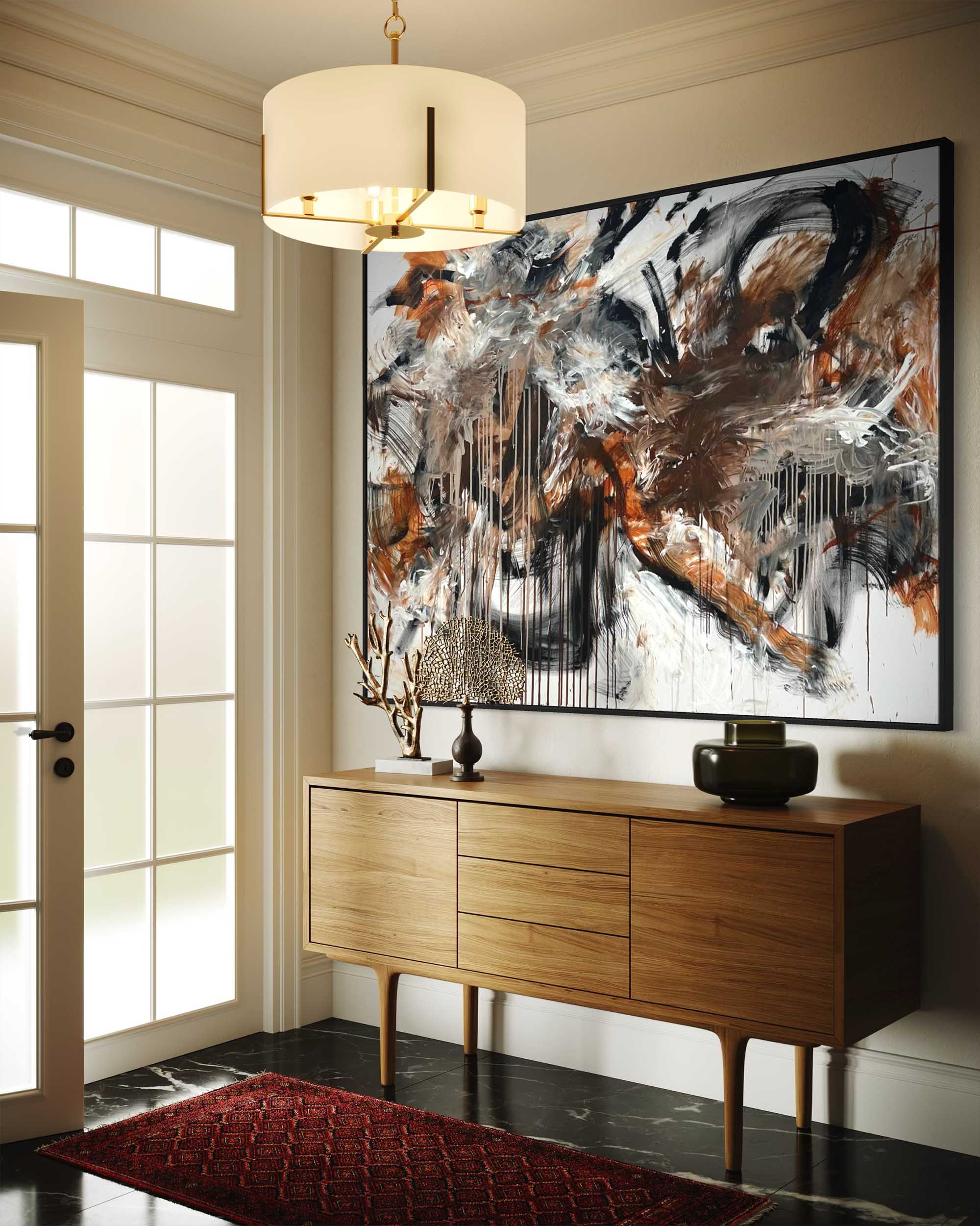
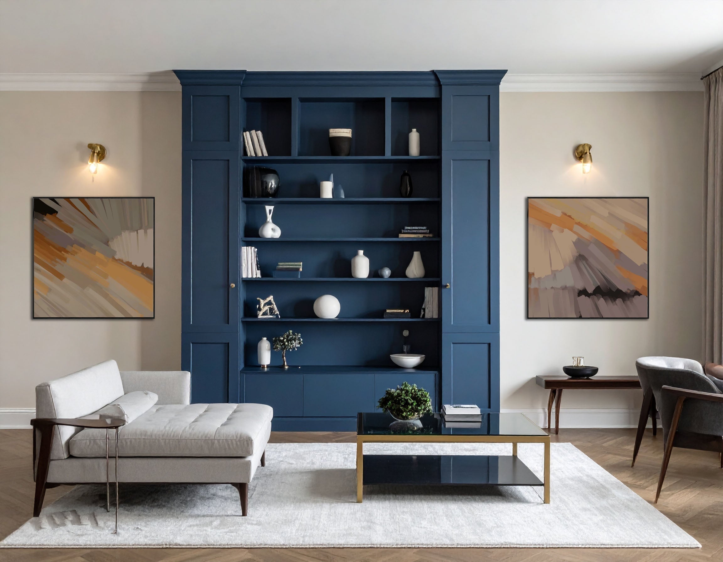
For living rooms, Wimborne White can handle bolder art choices. A large abstract original in burnt sienna, charcoal, and ochre sits beautifully against this backdrop — the warmth in the white connects with the orange and yellow tones in the painting, while the neutrality of the wall lets the work hold the room without overwhelming it. This is a classic Abstract House pairing: one confident artwork, one deeply considered wall colour, and a room that looks like it was put together by someone who really knows what they are doing.
For offices, consider photography or graphic prints in black, white, and warm grey. Against Wimborne White, these feel elevated and purposeful — creating a working environment that is inspiring rather than distracting.
Your Dream Space Starts Here
Wimborne White is not simply a paint colour. It is a decision to create a home that feels considered, calm, and genuinely beautiful — a home where the walls do quiet, extraordinary work in the background, allowing the things you love to take centre stage.
At Abstract House, we believe that great art deserves a great backdrop. Wimborne White gives it one. Whether you are starting from scratch in a new space or refreshing a room that has lost its way, this is the colour we would reach for first — and the one we come back to again and again.
Browse our curated collection of prints and original works that pair beautifully with Wimborne White, and let us help you build the room you have always imagined.
Farrow & Ball Wimborne White, No.239 is available in Estate Emulsion, Modern Emulsion, Estate Eggshell, and exterior finishes.

Author Bio

Summer Obaid, Director and Head Of Art Consultancy at Abstract House has studied Colour Theory and Colour Psychology. Passionate about connecting art lovers with pieces they love, Summer has completed over 250 art consultations, placing art in projects for luxury residential homes, yachts, hotels and corporate offices - working for both interior designers and homeowners.