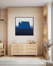
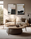
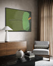
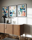
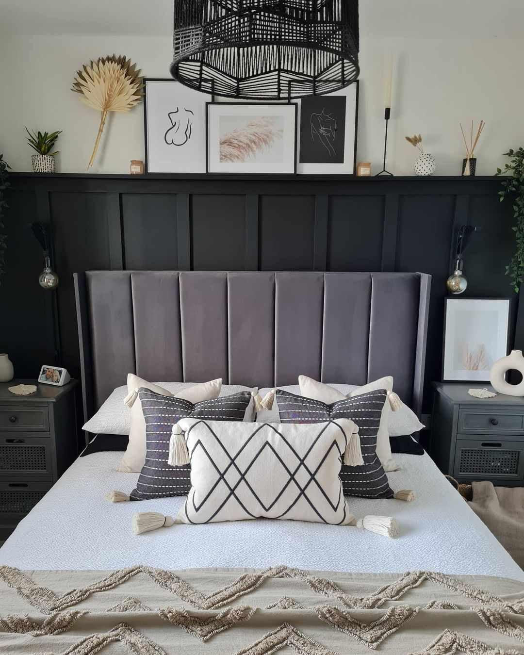
A “shelfie” is a much-loved feature on home decor and interiors accounts on social media, typically Instagram and Pinterest. Cleverly combining “shelf” and “selfie”, the hashtag is used when posting a picture of your harmonised display of books, artwork, plants, memorabilia, and more.
The picture ledges used are much like a gallery wall, but hanging art is replaced by a wide range of collectables and decorative items adorning shelving. But this isn’t just a lazy person’s version of a gallery wall. It’s a trend that has well and truly taken off, which now makes it a staple of stylish interior design.
Too often are our shelves filled to the brim with unsightly clutter. A traditional bookshelf or a glass cabinet of ornaments aren’t the only options, either. A picture shelf is the perfect opportunity to mix and match everything from old records, drawings, trinkets, souvenirs, family snaps, wall art, and more.

Image: taylorandmitch.wixsite.com/tandm
They’re also very versatile; great for the indecisive, the constant collectors who are always looking to switch up their home decor, and renters. A beautiful set of floating shelves is likely to make your landlord a lot happier than a bunch of holes in the wall from creating a traditional gallery wall.
Believe it or not, putting up the shelves is the easy bit; as is taking the #shelfie. It’s the styling where you do all the leg work. Getting the right balance of shapes, colour, size and arrangement adds character and individuality to your interior.
A gallery shelf makes the perfect focal point, merging neatness with an injection of colour and an eye catching collection. It’s an effective, stylish and functional use of wall space.
This makes it ideal for entrance halls, awkward nooks and alcoves, and everywhere in between. Use the space above your headboard in the bedroom, a study corner or home office, or even the bathroom.
Surrounding yourself with sentimental objects, photos, inspiration and art is one of the most joyous parts of styling your interior space. You’ll wonder why you hadn’t taken more notice of everyone’s #shelfies sooner...
How To Make A Picture Ledge: Styling Top Tips
The Humble Houseplant

Image: excusemyreading.com
The contrast of a shelving unit that’s well organised to sprawling houseplants is a fruitful one. Trailing foliage in particular creates a beautiful alternative texture and shape to shelves and their contents.
Regularly interspersing them throughout your shelves or making one an off-centre feature piece can be the key to success when styling a picture ledge or bookshelf. Let your luscious greenery get a little out of control for an effortless look. Not only do they look gorgeous and have vibrant colour, but plants are also great for our wellbeing.
Floor To Ceiling

Image: @littlebookwormbigapple on Instagram
Make the most of those high ceilings. Awe-inspiring floor to ceiling picture wall shelves are a bold look for any home. You could even have them expand width ways across an entire wall in a living room, dining room or study.
This is an encompassing look often used for traditional bookshelves. It tends to give more of a rustic feel, like that of your favourite secondhand bookshop.
Super Stacker

Image: @theshalomhome on Instagram
You should think outside the box when it comes to arranging your items. Shelves already run horizontal, so think about how you can create vertical areas of interest.
You might think books always have to go along the shelf, but why not stack them? Ornate bookends look just as good as a beautiful topper to a neat pile of books as they do propping up a row of them. Perhaps a vase could replace the traditional bookend?
Layering taller items behind shorter ones - an art print or a collection of books behind a figurine, for example - also draws the eye upwards. Encourage the onlooker to take in the shelving unit in its entirety for maximum impact. Open shelving is perfect for this look.
Minimal

Image: @whereheartresides on Instagram
Grouping is very important if you’re looking for the contemporary, minimal look - almost as if you stumbled upon this shelf styling by accident one day. Consider a limited, neutral palette with complementary materials, textures and shapes, such as ceramics and rattan.
Create small bundles of your accessories to form areas of interest a similar size, like a small stack of books compared to a vase. Vary the shape of the items, but keep in mind that the overall bulk of each group should take up nearly the same amount of space.
You can arrange these collections regularly across each shelf, striking a balance between sparse and crowded. This also avoids creating a single focal point.
Aside from a neutral palette, an achromatic colour scheme also makes a striking choice for this look. A black and white shelf styling is timeless and chic.
Showcase Collections

Image: @elmcottage1916 on Instagram
If you own a mix of pieces from a similar time period, you can create an effortless finish that avoids looking overly styled. For example, a collection of antique plates, mirrors, tea cups or prints.
Try to use objects of a similar size, focus on layering, and don’t worry too much about the precision of your spacing. If you’re a collector, then this is the look for you.
You can make this look more contemporary whilst maintaining its old world charm with retro, art deco or cottage core styles.
Colour Coordination

Image: @booksandpops on Instagram
Here Penguin Clothbound Classics are colour matched to Funko POP figurines of Pokemon. This eclectic marriage of old novels with bold new covers to anime characters is made possible through the use of colour. This rainbow styling is perfect for the kids, or lovers of pop art, comics and manga.
If so many different colours don’t suit your style, consider still using this is a basis for working with colour. Could you group similar or complementary colours together on your picture ledge? Would this help you create a colour scheme that fits the existing interior design?
Understanding how colour could make or break your #Shelfie is really important, regardless of whether you favour brights or neutrals.
The Relaxed Look

Image: ev-home.co.uk
If your style is a little more relaxed or industrial, you might want to opt for a wire, metal or wooden leaning shelving unit. Or even one on wheels, like an old library trolley or set of serving trays.
Propping these against the wall will give that light styling you’re after. It’s also a great way to avoid hanging shelves if you’re renting.
Another way to create a non-uniform display is to not group similar items together, as previously said. In this scenario, irregularity is also your friend.

Image: jen-campbell.co.uk/
Create a laid back feel by dispersing your treasures seemingly randomly across the whole shelfspace. What would appear haphazardly selected and placed is in fact quite the opposite. A mix of shapes, patterns and textures helps this look on its way.
Shapely Shelving

Image: @clairee_home on Instagram (of bmstores.co.uk)
It isn't just the objects on your shelving that can create a variety of shapes for your #shelfie. Each ledge can be an eye catching piece in its own right.
Opt for geometric shelves and those with built-in compartments to house your collections of curiosities.

Image: acumencollection.co.uk
Our whistle-stop tour of picture ledge ideas has you well on the way to taking your very own perfect #shelfie. A spring cleanup of your shelves is calling - and your home decor will thank you for it.
Lead image: @home_at_door4 on Instagram.


