


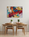
If you are looking to decorate your home, Farrow & Ball's new paint collection could transform the dynamic of your space.
Edited May 2025
Whether you are looking to add a light and airy feel to your room, or a darker, luxe aesthetic, the British upmarket paint manufacturer Farrow & Ball could have the exact shade to create the space of your dreams.
Farrow & Ball have been setting interior decorating trends since 1946 when the company was formed in Dorset, England. The founders, John Farrow and Richard Maurice Ball were two former chemists, and today, the company has grown to become one of the world’s most exclusive and trusted paint manufacturers, with around 132 shades in their portfolio.
This post contains affiliate links
British Made Quality Paints
We love that Farrow & Ball paints are all manufactured in England, in fact in their Dorset warehouse. They mirror our values here at Abstract House, by refining traditional craftsmanship with premium materials to delight walls around the world. Their skilled team of craftsman and colour experts conjure up the most exciting and on-trend colours for use throughout the home.
They have worked with the National Trust to match colours used in original interiors and exteriors of historic buildings and even created a shade of white reviewed by the New Yorker. Farrow & Ball have also written several books throughout their lifetime, predominantly about paint and decorating tips, and in 2021, Channel 5 broadcasted a documentary about them entitled Farrow & Ball: Inside the Posh Paint Factory.
Here are the top 10 Farrow & Ball paint colours for 2025.
Setting Plaster – A soft, earthy pink that exudes warmth and sophistication, ideal for creating a serene ambiance in living rooms or bedrooms.
Green Smoke – A deep, moody green with grey undertones, perfect for adding depth and character to studies or dining rooms.
Hague Blue – A rich, dark blue that brings a sense of drama and elegance to any space, particularly effective in creating cozy, intimate settings.
Skimming Stone – A warm, light grey with subtle beige undertones, offering a versatile neutral backdrop suitable for various rooms.
Pigeon – A muted blue-grey with green undertones, providing a calming and sophisticated atmosphere, especially in kitchens or bathrooms.
Railings – A soft black with blue undertones, delivering a bold yet refined statement, ideal for accent walls or cabinetry.
Broccoli Brown – A deep, earthy brown that adds warmth and richness, perfect for creating a cozy and grounded feel in living areas.
Dibber – An earthy, mossy green inspired by traditional gardening tools, bringing a sense of nature and tranquility indoors.
Kakelugn – A tranquil, light blue inspired by Swedish tile stoves, offering a fresh and airy feel, ideal for bedrooms or bathrooms.
Etruscan Red – A rich brown-red that adds a touch of timeless elegance and warmth, suitable for creating inviting and sophisticated spaces.
These colours reflect the 2025 trend towards warm, nature-inspired hues that bring comfort, serenity, and personality into the home.
Edited August 2023
They have become known for curating exotic product names that conjure up images of everything from tropical travel destinations to distant lands, to folklore and nostalgic shades that hark back to childhood days.

So what are the most popular Farrow & Ball paint colours?
Sardine is a much-loved unique blue, perfect for living room joinery or bedrooms.

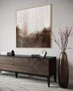
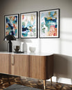
Skimming stone is described as a versatile light greige paint, with neutral tones offering more warmth than a grey or white.

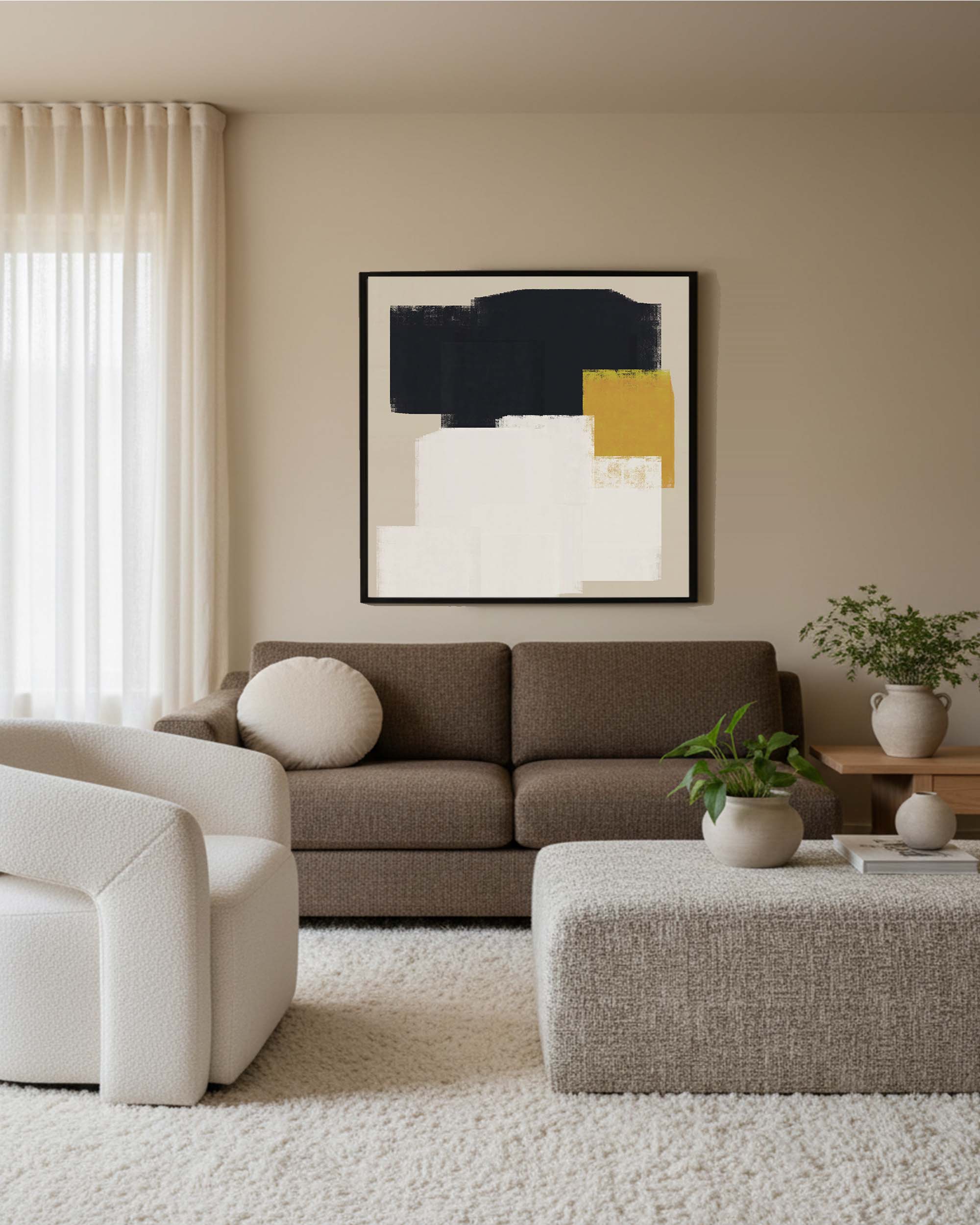
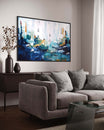
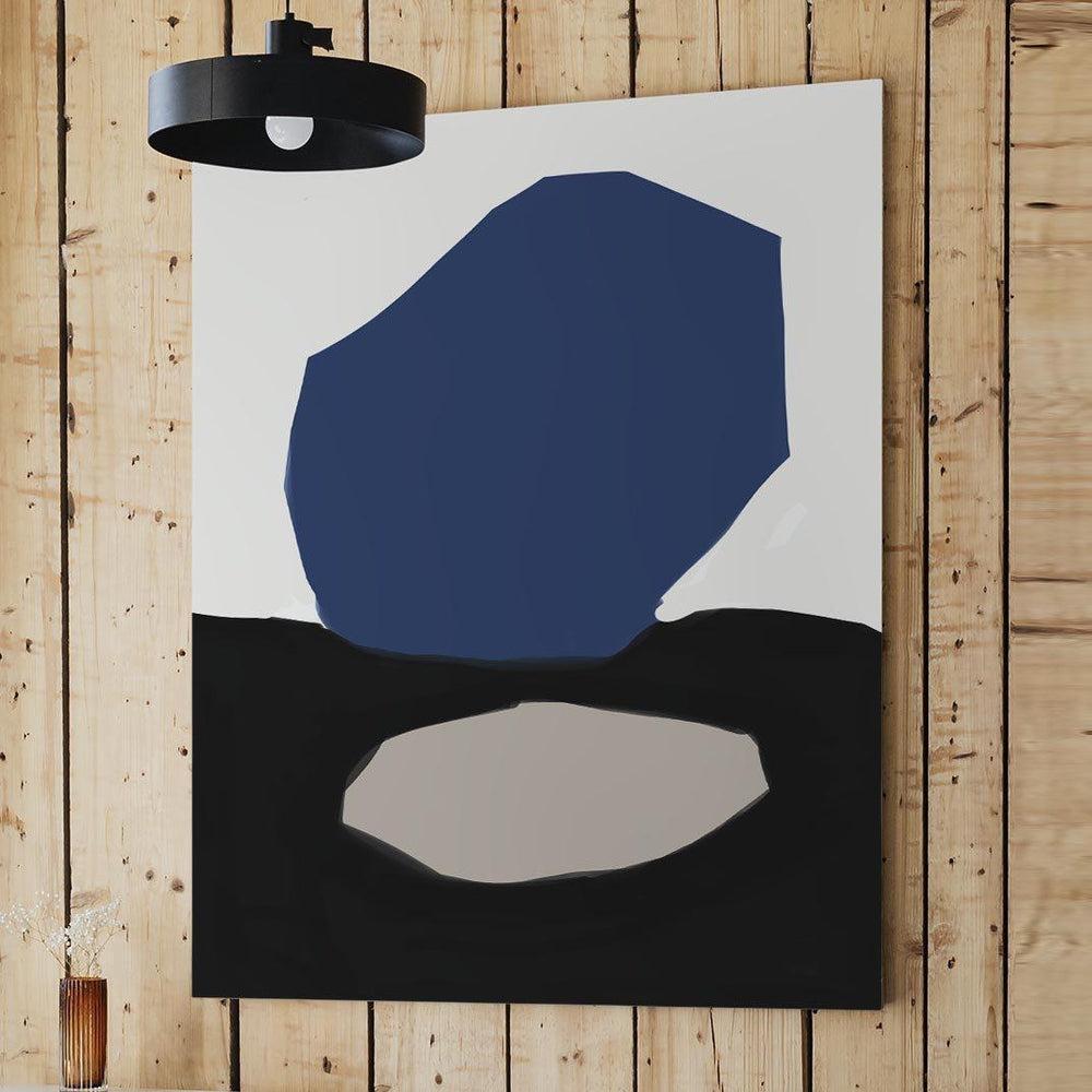
Artwork Pictured: From The Neutral Art Collection
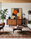
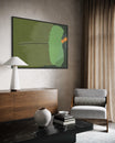
Pigeon is one of Farrow & Ball's most popular greens. It is a mid blue grey with green undertones, so offers a fresh pastel feel, perfect for adding light to any space.

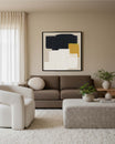
Artwork Pictured: From The Green Wall Art Collection
What Farrow & Ball Colours Were We Loving Last Year?
For 2023, they have chosen five enticing and versatile colours, which are functional, simplistic and exude opulent comfort. Joa Studholme, Farrow & Ball’s colour curator described their choices in a press release, “There is something inherently human in the colours that we are attracted to for 2023, as well as the way we use them” Joa continued “They are an eclectic mix of the pure and the humble that evokes the warmth and harmony of a more innocent age while celebrating life today. Function goes hand in hand with ornament, using colours and finishes in unusual ways to celebrate the principles of utility, kindness and honesty”.
Their five-colour trends are bolder than those predicted by other paint manufacturers, and they are all familiar comforting shades, promoting optimism, cheerfulness and well-being – subtle without being overwhelming, the perfect colour palettes for this year. Many of the colours complement each other and can be used together, so, without further ado, here are the Farrow & Ball Colours of the Year 2023.
So, let's move on to the best Farrow & Ball paint colours.
Farrow & Ball Colours Of 2023
Breakfast Room Green No. 81

Breakfast Room Green is subtle and uplifting, a mix of heritage and modern that brings a calmness and elegance to any room. It’s a colour which is noteworthy whether bathed in the bright sunlight of dawn as you sip morning coffee or in soft, atmospheric candlelight in the evenings. When used as a background for abstract artwork, on feature walls or woodwork it is particularly striking, and if you place an antique or crystal vase with bright orange or tangerine floral displays in them, together the colours burst with joy. Breakfast Room Green looks amazing when teamed with other Farrow & Ball trending shades - Stone Blue, Incarnadine or School House White and the colours can be used in almost any room in the home for an eye-catching effect.

Babouche No. 223

A bold choice, mustardy yellow 'Babouche' is the perfect addition to add a pop of colour to your walls. We see this colour adorning walls from front doors to cloakrooms across the nation for that zesty blitz we all need to brighten up our days.
Babouche is a cheerful shade, one that heralds a return to normality – an ochre hue that intensifies when paired with crisp white accents and vibrant biophilia. The shade is named after the colour used in Moroccan slippers worn by men. The footwear can often be found in souks in Tangiers or Marrakech, stacked in woven baskets or displayed in rows of soft leather with rounded or pointed toes. The vibrant shade sits well with Zellij style or gloss, and matt white ceramic tiles and the paint brings a sunny ambience to any room without feeling overwhelming. If paired with Manor House Gray or School House White, clean lines and minimalist furniture it can also curate a Scandinavian vibe. Babouche works in hallways, bathrooms, living rooms, bedrooms and kitchen areas – a happy sunshine yellow always guaranteed to make you smile.
Incarnadine No. 248
Incarnadine is a deep, dramatic rich shade of crimson that you find in aristocratic stately homes hidden behind portraits of ancestors or country landscapes in gilded gold frames. The name derives from the Latin word for ‘flesh-coloured’ or ‘pinkish hue’, however in modern day terms it’s widely used to describe crimsons and reds. Incarnadine is a colour that exudes classic glamour, and can bring a traditional, or edgy and graphical look to any room, depending on complementing furnishings and accessories. Perfect for long tiled hallways, living rooms with original fireplaces and bedrooms seeking a boudoir ambience or colour block styling, Incarnadine is bold, energetic and is similar to the deep red used by David Hicks at Barons Court in the 1970s. Incarnadine also looks great when painted on wooden wardrobes, doors and tables.
Stone Blue No.86
One of our favourite tones, Stone Blue is a grown-up choice ideal for adding charm to any living room or bedroom. Stone Blue is named after an indigo pigment imported in lumps during the 18th century. In days gone by, blue was a colour only afforded by the wealthy for their mansions, as the pigments were expensive and unaffordable to the working class, but today, it is accessible to everyone. Stone Blue is lively and so versatile that it can be used on window frames, on cottage doors, in living areas, bedrooms and almost every other area in the home. The calming blue hues always look different depending on how the light catches them and when paired with Babouche, Farrow & Ball’s Rangwali (named after powder colours used in India’s Holi Festivals) and School House White, it can be a breath-taking combination. Stone Blue works well in historic properties with long, sash or bay windows, pair with antique chandeliers and vintage wall posters or artwork for a contemporary, yet old-world salon vibe.
School House White No. 291
With the trend of indoor wall panelling at an all-time high, we couldn't help but admire this neutral choice which will certainly add an edge to any boot room in the home. School House White is a timeless shade, a soft, slightly off-white colour that is fresh, pared back and familiar – a nostalgic tone, inspiration coming from the walls of old schoolhouse buildings. When paired with dark wood panelling, deep burgundy and blue shades, wingback armchairs or even monochrome artwork, the light colour really comes into its own and there’s an understated warmth that you don’t usually achieve from other tones in the white paint family. School House White works well with many of the five Farrow & Ball 2023 colours including Babouche, Stone Blue and Breakfast Room Green.
How to choose the perfect paint colour?
Finally, here are a few top tips for choosing the right Farrow & Ball trending 2024 colours to suit your home.
Firstly, build your dream colour palette around key furniture and accessories – these are usually statement pieces like sofas, a large dining table or armchairs. Then pop your ideas onto a mood board or use state-of-the-art Augmented Reality apps to see how your chosen colours will look with existing furniture in each room. Once you have these ideas in place, you can begin to curate a delightful, tailored space where you can relax and unwind with a book, watch a movie, or an area where the entire family can come together for breakfast, lunch or dinner.
Choosing the right artwork can also enhance your space and colours, it can pull your chosen look together to make it look modern, traditional, or even give it an edgy vibe. If you need further inspiration, our extensive collection of abstract style works may help you to define your choices and personalise your room.
Discover more of our favourite Farrow & Ball paint colours. Happy decorating!
Our Favourite Paints
De Nimes No.299

The deep blue tones of the De Nimes No.299 paint shade make it an ideal choice for a living room or dining room. Adding different textured fabrics in a matching colour can really bring the paint into it's own, as seen here at the RHS Chelsea Flower Show at Jardin Blanc.
Worsted No.284
Described as a rich grey, the Worsted No.284 oozes elegance and will instantly make your room look and feel more glamorous. Pictured here on a single wall, the Worsted No.284 paint colour looks graceful alongside a tall chandelier.

Light Blue No.22
The subtle softness of Light Blue No.22 adds the perfect border in any room. If you want something other than Magnolia, we certainly recommended this colour as a good alternative.

Pink Ground No. 402
A splash of pink can brighten up any room, and the dusty tones of Farrow & Ball's Pink Ground No.402 colour can evolve.
Described as the softest blush pink colour for a soothing finish that doesn't feel sugary, we love how grown up this colour feels and can't wait to see it in action!

Eco-Friendly Paint

In an exciting new collaboration with The Natural History Museum, Farrow & Ball have launched a brand new collection called Colour By Nature in a bid to enable you to bring the true colours of nature into your home.
We took a look at the collection and chose our favourite colour!
Imperial Purple No.W40

Ideal for creating a bold colour wall in a dining room or bedroom, the Imperial Purple No.W40 can transform a room into the modern age. The paint was created using deep parts of Flower of Saffron Crocus, so choosing this sustainable paint colour truly brings the outdoors in!
Farrow & Ball have revealed their top colour choices over the years. It's the moment you have all been waiting for, and Farrow & Ball, Britain's colour experts and paint manufacturers, delivered an eclectic mix of colours which have been selected by the including a take on avocado tones with 'Breakfast Room Green' amongst the mix.
We hope you enjoyed reading about our favourite Farrow & Ball paint colours.
Looking for more inspiration on Dulux paints? Look no further, read on to find out 5 reasons why Brave Ground is the Dulux colour of the year.