In theory, choosing art by colour is simple: pick what you like. In practice, it is a little more considered than that — particularly when you want a home that feels genuinely cohesive rather than decoratively busy.
This guide will help you make confident colour decisions room by room, drawing on both design principles and the psychological effects of colour explored in our companion piece.

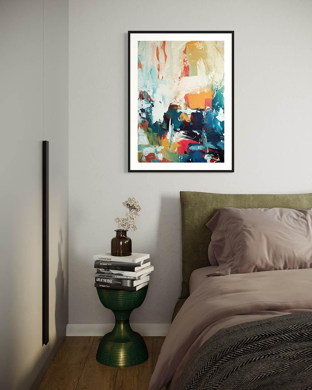
The Bedroom: Rest, Restoration, Calm
The bedroom has one primary function: it should feel like the best version of rest. The art you choose here should support that, not compete with it.
Best colours: deep soft blues (navy, slate, dusk tones), pale sage greens, warm off-whites and linens, muted blush. These are colours the nervous system reads as calm and safe.
Avoid at scale: high-contrast black and white (visually stimulating), bright reds or oranges (energising), very saturated yellows.
Our collection, Art For Bedroom works particularly well in bedrooms — the soft tonal ranges create quiet visual landscapes that settle rather than stimulate. One practical note: scale matters. A single large, calm abstract above the bed will deliver more restful atmosphere than a busy cluster of smaller works.

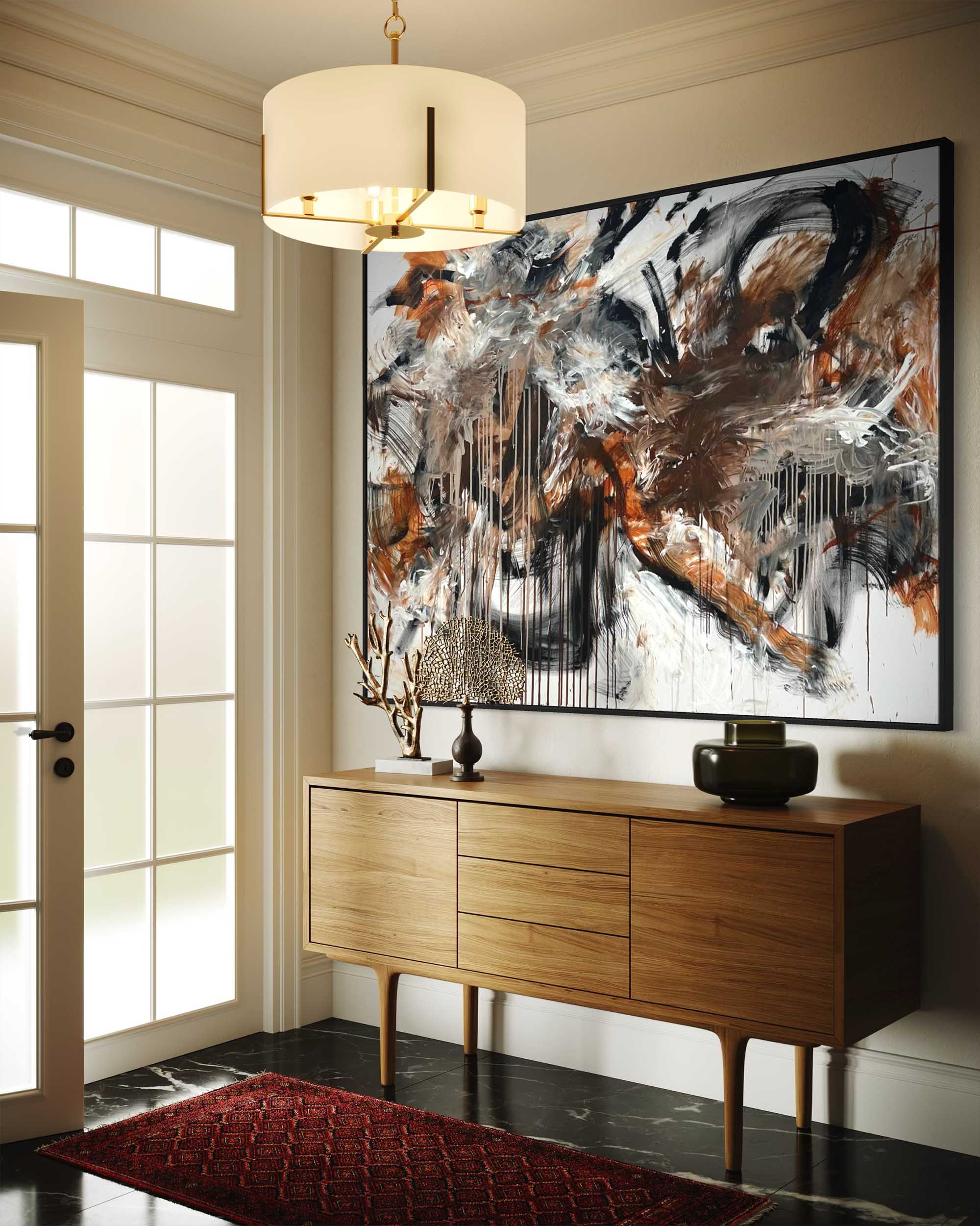
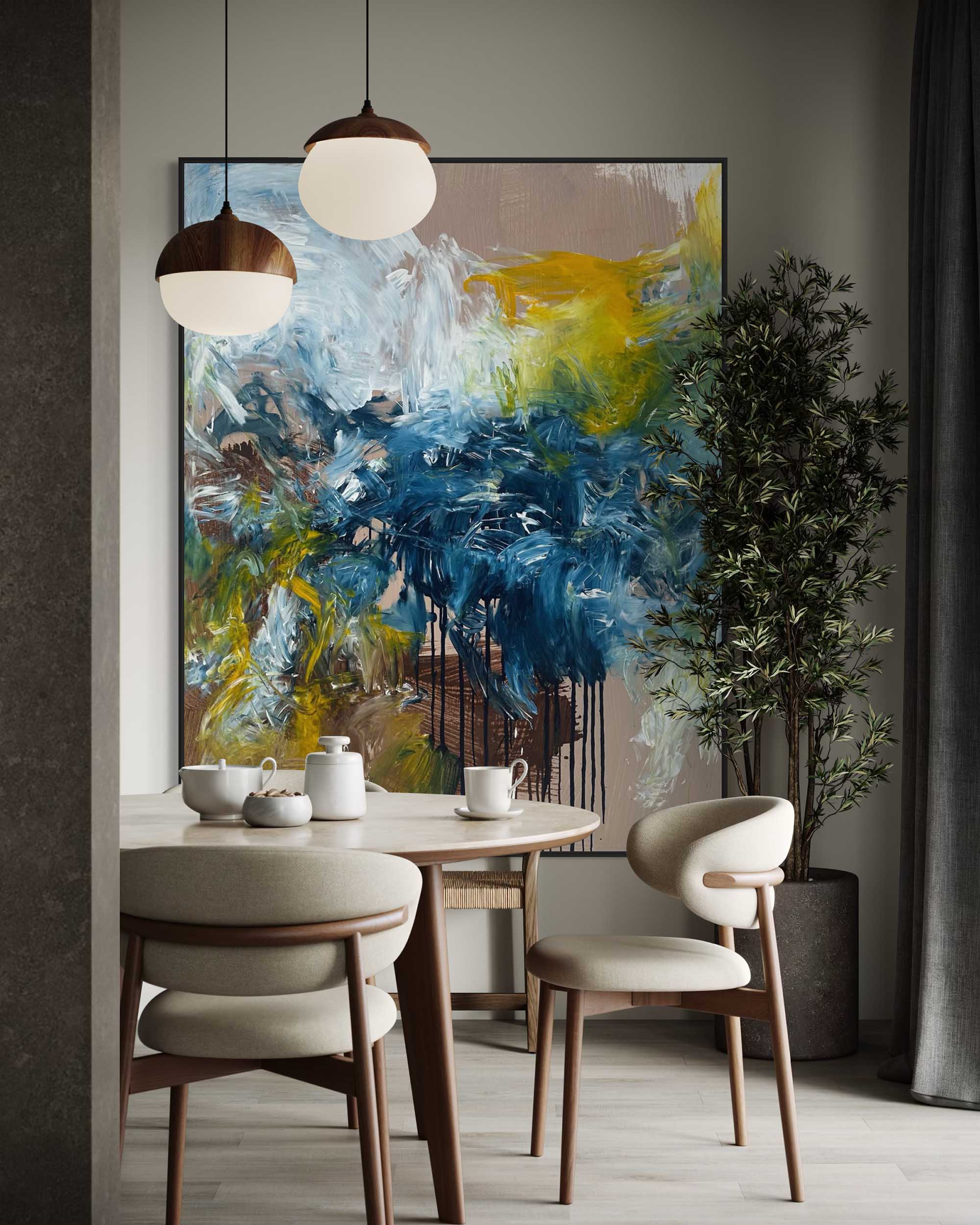
The Living Room: Expression, Warmth, Connection
This is where you can take risks. The living room is the most public space in a home — it is where guests form their first impression of your taste, and where you spend time connecting with people you love.
Best colours: warm ochres, terracotta, earthy reds, rich warm neutrals, deep greens. These are colours that promote sociability and feel alive in artificial evening light.
Work from our Art For Living Room collection — with the gestural marks and layered earthy palettes — make strong statements above a sofa or fireplace without feeling aggressive. As a general rule, artwork above a sofa should be roughly two-thirds the width of the sofa. A piece that is too small for its space feels tentative rather than decorative.

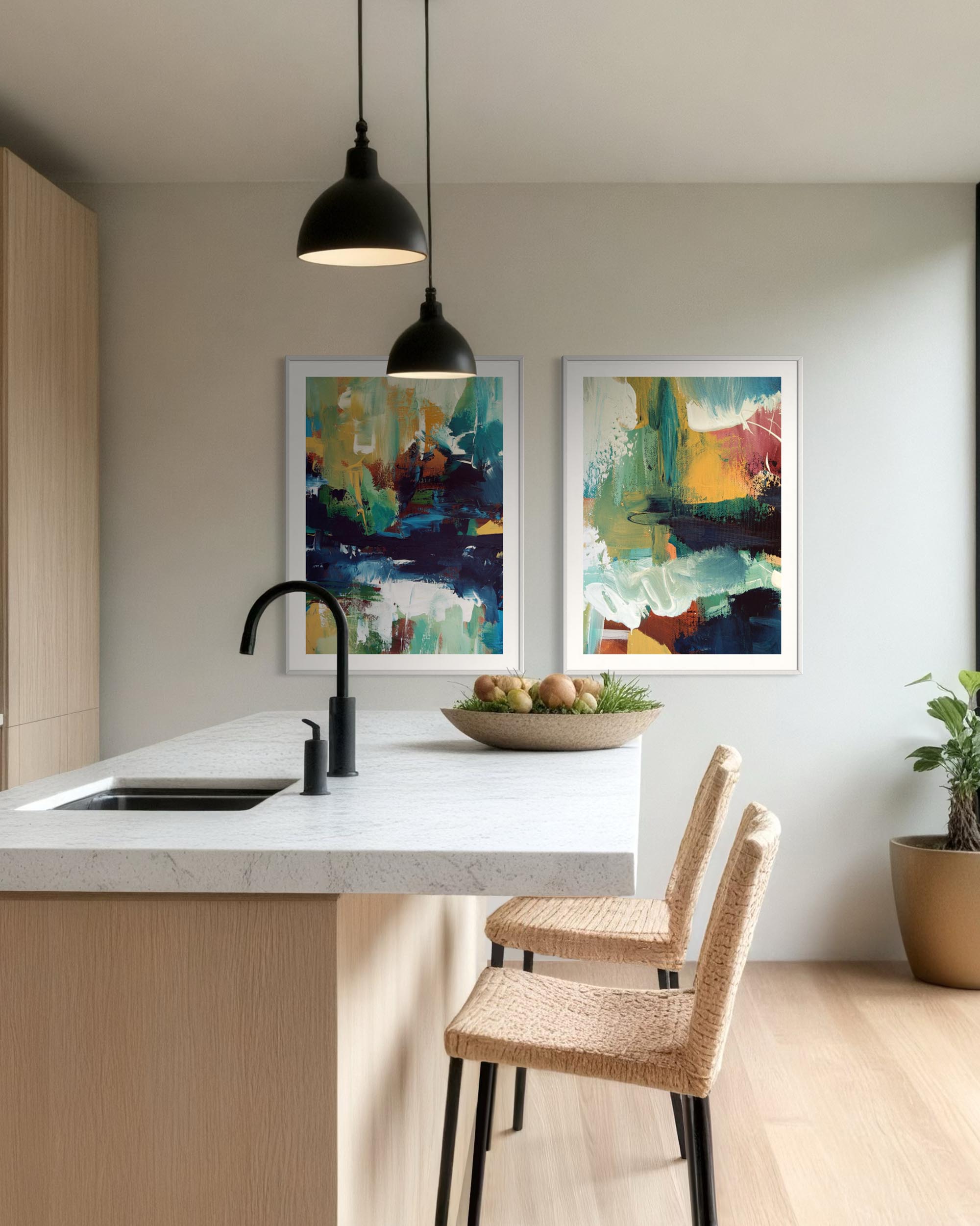
The Kitchen and Dining Room: Energy and Appetite
Warmth and energy are your allies in eating spaces. Kitchens and dining rooms benefit from colours that feel convivial and alive.
Best colours: warm yellows, organic greens, earthy reds, ochre tones. These are colours that promote appetite and animated conversation. Flora collection prints work beautifully here — their organic, nature-inspired forms feel right at home alongside the textures of a kitchen.

The Home Office: Focus and Flow
This is where colour choice becomes genuinely functional. The colours around you while you work affect how you think.
For focused, detail-oriented work: cooler, quieter palettes — pale blues, soft greys, clean neutrals. These reduce distraction and keep the eye rested. For creative work: richer blues, blue-greens, and deep teals have been shown to enhance creative output in research settings. The Void collection, with its deep atmospheric tones, is a strong choice for a creative workspace.

The Hallway: Welcome
Hallways are transitional spaces — their job is to set a tone and prepare you for what follows. A confident, considered piece here signals that the rest of the home has been equally thought through.
Best colours: warm and welcoming — ochres, soft terracottas, warm whites. A bold statement piece that works as a visual anchor as you enter.
One final thought
Colour is personal. The frameworks above are not rules. But understanding what colours do — beyond what they simply look like — gives you the confidence to choose not just with your eye, but with genuine intention.