1. Introduction: What are Dirty Neutrals in Interior Design?
We've all heard of the limestone trend, but when you hear the words 'dirty neutrals', it may sound like the aftermath of a muddy walk in the fields with your four-legged friend. For all those opposed to simple beige decor, never fear - this new trend is rocking the interior decorating world with a mission to make plain, neutral interiors a little more atmospheric and 'lived-in'. Think browns, dark beiges, olive green tones and textural features - colours which can really come into their own when brought into your home interiors, instantly elevating your space.
Neutrals have starting shifting from clean white and grey interiors to muddier, darker tones as people crave the calming connection to nature that brown and green shades bring. While there was an upwards shift of many city dwellers moving to the countryside in recent years, for those whose lives are rooted in the capitals and city centres, updating their own spaces with earthy, muted tones creates a grounding atmosphere which promotes relaxation

Photo Credit: Abstract House Guide to the dirty neutrals trend.
Interior designers, particularly when designing family homes for longevity, aim to create purposeful spaces that can be enjoyed. The colour palette of richer browns and tonal greens creates an ambient space with a unique aesthetic and atmosphere - perfect for all seasons.
So, if you're a home decor lover and are looking to select new art to hang on your walls when decorating your home or office interiors, we've made things a little simpler for you with these new muddy-expressive wall colours. When choosing artwork to hang in your living room, for example, our expert Art Consultants advise to always go for a piece of art you love. If you're uncertain about which colour to select from, you can always choose a tone that is darker than the colour that features on your wall or in your home accessories, such as your sofa, and start from there. 
Our experts have put together this free guide with examples of room colours and styles to tell you all you need to know about the dirty neutral trend, and how to decorate your space with art.
Here are some ideas to get you inspired.
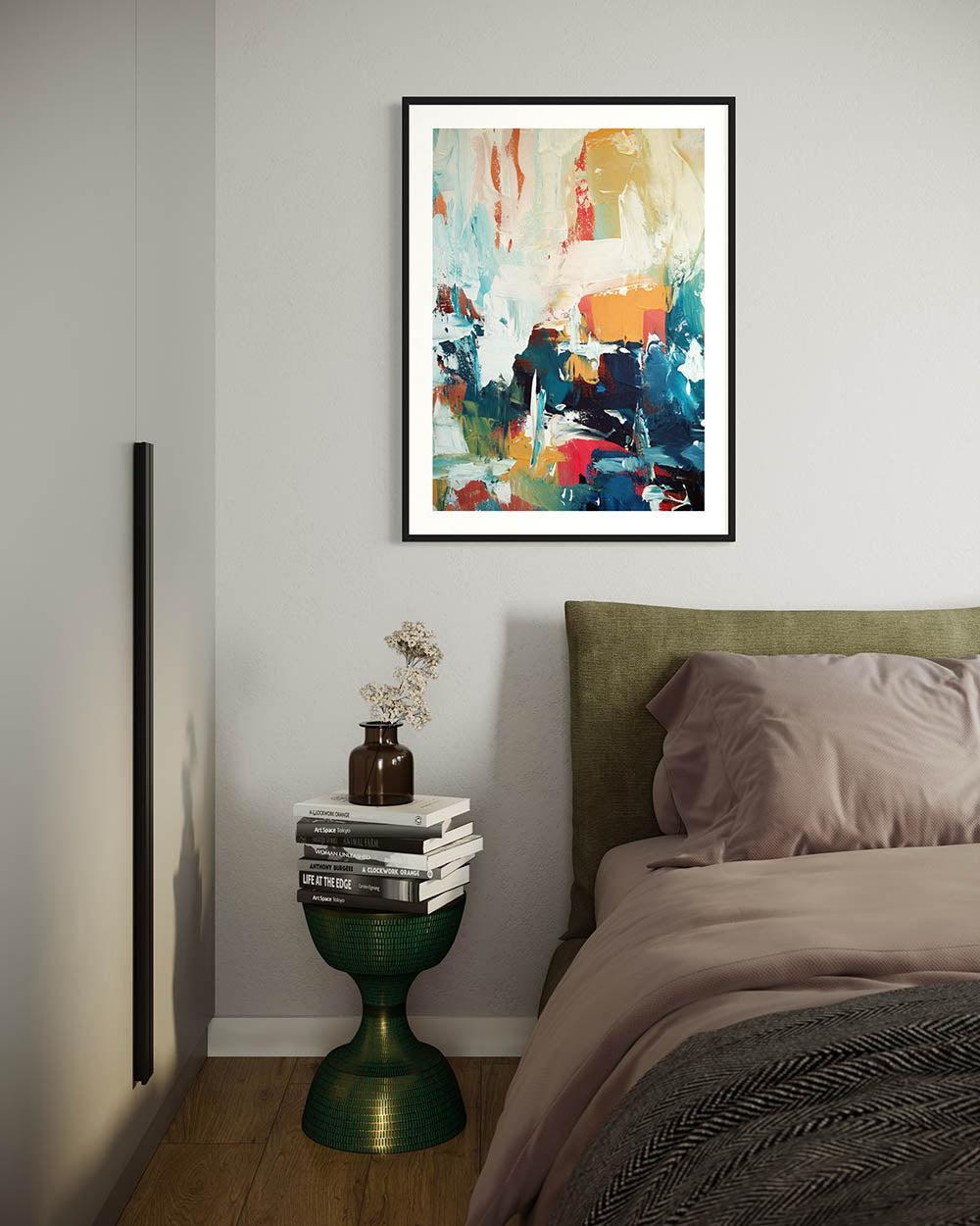
 Artwork: Neutral Abstract Sands Framed Canvas Photo @No33Interior
This dark neutral-beige bedroom features some natural materials such as marble, clean ceramics and selected furniture pieces in a contrasting black colourway. We recommended our 'Neutral Abstract Sands' canvas artwork for this space and Eleanor from @No33Interior absolutely loved the way the artwork transformed her space.

2. Why Dirty Neutrals Are the Next Big Thing in Interiors
Residential design has steered more towards earthy, natural palettes in recent years as a form of bringing nature's elements into the home to create a calmer environment - a space you can really live in and unwind.
Major interiors exhibitions in London, Paris and New York have begun focusing on sustainability with the aim of creating a more robust circular economy. Change can begin with our home decor choices, by selecting more refined pieces that are built to last. By focusing on quality over quantity, you're bringing in pieces you love for your space, but pieces that will last and can even be handed down for generations to come.
The desire for more sustainable interiors has also grown due to the influence of the Wabi-Sabi aesthetic stemming from Japan. This earthy palette has a knack for adding atmosphere to a room, bringing in warmth and depth - while evoking emotions and creating an emotional connection with your space - both for it's residents, as well as guests.

Artwork: The Olive Branch Framed Canvas Art by Abstract House
3. Muddy Brown Paint Colours: The New Alternative to Grey
Grey once had its place: calm, versatile, chic. But for many, it’s begun to feel cold and overdone. Enter muddy browns—think shades that borrow warmth from clay, soil, and stone. These tones sit in that sweet spot between taupe and chocolate: soft enough to be neutral, but with a quiet drama that grey simply can’t offer.
Where grey can sometimes flatten a space, brown adds character. It brings the outside in, with an organic quality that feels grounding yet sophisticated.

Art: Subjective Modern Canvas Wall Art
Paint manufacturers known for their high quality and craftsmanship have been quick to spotlight this family of tones:
-
Farrow & Ball – Colours like London Clay or Mouse’s Back give a heritage edge, perfect for classic-meets-contemporary homes.
-
Little Greene – With nuanced browns such as Mid Lead or Scree, Little Greene’s eco-friendly formulas tick the sustainability box for conscious decorators.
-
Benjamin Moore – Their palette offers softer muddy hues, ideal if you want to lean into modern, airy spaces while still bringing in warmth.
The fact that these respected brands are pushing muddy neutrals suggests this isn’t a fleeting trend—it’s a new classic.
Muddy browns work best when layered with tactile, natural materials:
-
Raw wood: From oak shelving to a reclaimed coffee table, timber enhances the earthy character of brown walls, creating a cocooning, organic feel.
-
Textured fabrics: Think bouclé, heavy linen, or wool throws in stone, ivory, or caramel shades. These add depth and softness without competing with your art.
-
Ceramics: Hand-thrown vases or matte pottery pieces in muted whites or terracotta look beautifully elevated against a muddy backdrop.
This combination creates a home that feels warm, cultured, and quietly luxurious—never sterile.

One of the most exciting aspects of this palette is what it does for your art. Unlike stark white walls, which can sometimes glare or feel too clinical, brown adds a softness that lets colours breathe. A bold abstract print or a delicate line drawing suddenly has more presence, as the earthy tone behind it provides both contrast and harmony.
For those curating a gallery wall or showcasing a single statement canvas, muddy neutrals create a cocoon-like atmosphere, drawing the eye to the artwork as the focal point. It’s the difference between a piece simply hanging on a wall and a piece truly anchoring a room.
4. Limestone Walls & Textured Surfaces for Timeless Appeal
Neutrals are never just neutrals. The best interior designers know that subtle shifts in tone and texture can completely alter the atmosphere of a space. While painted walls will always have their place, the rise of stone-inspired finishes—particularly limestone—has brought a new dimension to interiors. Earthy, tactile, and quietly luxurious, limestone walls are becoming the modern alternative to flat colour, adding depth and soul to neutral schemes.
For art lovers, limestone isn’t just about walls—it’s about creating a timeless canvas that allows contemporary and traditional pieces alike to feel more intentional, more curated.

Art: The Echoes Of Time Original Painting by artist Omar Obaid
Where smooth plaster once ruled, homeowners are now gravitating towards walls that feel natural, layered, and imperfect. Limestone, with its soft mineral hues and organic texture, offers a sense of permanence that’s both ancient and modern. It has that timeless ruin-meets-modern gallery quality: raw, yet refined.
Unlike sleek greys or creams, limestone brings a subtle movement to walls. It catches the light differently throughout the day, shifting in mood and tone, which means your space never feels static.
Limestone Effect Paint and Plaster Finishes
You don’t need to clad your living room in actual stone to achieve the look. A new wave of limestone-effect paints and plasters makes it possible to recreate the chalky, weathered aesthetic in a sustainable, practical way. Limewash paints: Brands like Bauwerk or Kalklitir are creating mineral-based paints that echo limestone’s natural matte patina. Venetian plaster finishes: For a more tactile effect, microcement and lime plaster offer subtle striations and tonal variations that give walls depth without dominating. Eco credentials: Many of these products are low-VOC, breathable, and sustainable—ideal for design lovers who want conscious choices without compromising on beauty.

Art: Interference II Original Abstract Painting by London artist Omar Obaid
How Stone-Inspired Walls Add Depth to Neutral Spaces
Neutral interiors can sometimes feel flat, but limestone adds a textural richness that elevates them instantly. Its gentle irregularities create shadows, dimension, and warmth, preventing beige or cream schemes from veering into bland territory. In minimalist spaces, it injects character. In maximalist ones, it provides a grounding calm. That versatility is why limestone-inspired finishes are gaining traction—they don’t dictate the mood, they enrich it.
Blending Limestone with Contemporary or Traditional Art 
Art: Abstract Pastel Beige Framed Canvas Wall Art Print Set
Here’s where limestone walls really shine: as a backdrop to art. Contemporary art: Abstract canvases, bold prints, or sculptural pieces feel amplified against the softness of limestone. The stone’s earthy depth highlights saturated colours and dynamic forms. Traditional art: Oil paintings, classic portraits, or vintage sketches take on a museum-like quality when set against limestone, evoking old-world elegance without feeling stuffy. The magic lies in contrast: the organic imperfection of the walls plays beautifully against the precision of a frame, the crisp edge of a canvas, or the vibrancy of pigment. It’s not just a backdrop—it’s part of the composition.
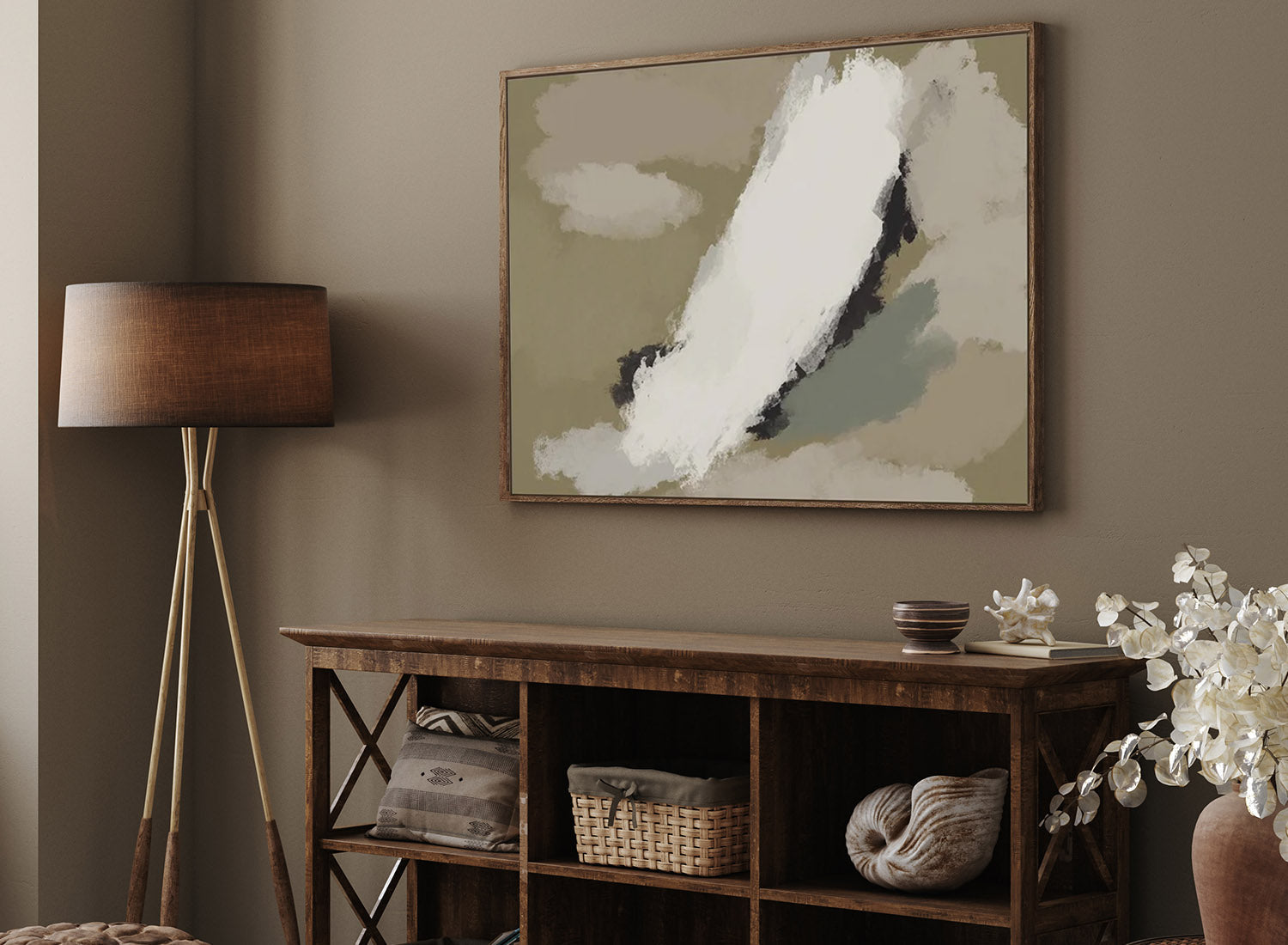
5. Dark Beige Interiors: Sophisticated Yet Understated
 Art: Cave Drawings II Framed Canvas Art
Dark beige sits in that sweet spot between warmth and restraint. It’s not as stark as taupe, not as heavy as brown, and less predictable than grey. Instead, it offers a sophisticated calm—subtle enough to let furniture and artwork shine, yet full-bodied enough to make a room feel thoughtfully curated. The beauty of dark beige is its duality: it whispers rather than shouts, yet always feels intelligent and grown-up.
The Difference Between Beige and Dark Beige
Where classic beige can sometimes feel flat, dark beige adds pigment and depth. Imagine the shift from sand to wet stone, or from linen to hessian. There’s a quiet richness that instantly adds dimension, giving walls a soft sculptural quality. Light beige is great for breezy, daylight-filled interiors, but dark beige truly comes alive in moodier, layered spaces. It provides an architectural gravitas—perfect for those who want a neutral that doesn’t disappear into the background.
Balancing Modern and Rustic Interiors  Art: The Journey extra large abstract paintings in oil and acrylic by artist Omar Obaid
Dark beige is a true chameleon. In modern interiors, it pairs effortlessly with clean lines, smoked glass, and sculptural furniture, creating a sophisticated, gallery-like mood. In rustic homes, it complements raw textures—oak beams, terracotta tiles, hand-thrown ceramics—without feeling too polished or contrived. This adaptability is why interior designers are embracing dark beige: it bridges contemporary and heritage influences with ease, making it the ideal shade for the modern eclectic home.
Dark Beige as a Gallery-Style Wall Colour
For collectors of art, wall colour matters as much as the frame. Dark beige offers a subtle, grounding backdrop that enhances artwork rather than competing with it. Contemporary paintings pop against its warmth, with colours appearing richer and more dimensional. Traditional pieces benefit from the shade’s heritage undertone, evoking the atmosphere of old-world galleries where stone and plaster walls framed masterpieces for centuries. Gallery walls in dark beige feel curated rather than chaotic, with the neutral tone tying together diverse pieces into a harmonious whole. It’s the kind of colour that doesn’t just frame art—it elevates it.
6. Olive Green Decor: Bringing Neutrals to Life
Unlike beige or taupe, olive has an inherent energy. It draws on nature—the tones of moss, leaves, and aged stone—yet feels refined enough for the most cosmopolitan of interiors. It’s a neutral, yes, but one with personality. Where pale greys can risk sterility, olive green adds warmth and character without overwhelming a space. It’s that rare shade that feels as comfortable in a minimalist townhouse as it does in a rustic countryside retreat.
Art: Olive Green On Black Strokes Framed Art
Art: Olive Green On Black Strokes Canvas Art
Why Olive Green Works as a Grounding Neutral
The secret lies in its earthy undertones. Olive green absorbs light in a way that feels cocooning and grounded, giving rooms a sense of balance. It creates an atmosphere that’s simultaneously serene and sophisticated—anchoring a scheme without demanding all the attention. This grounding quality is why designers increasingly treat olive green as part of the neutral family. It doesn’t read as “colourful” in the traditional sense—it reads as lived-in, timeless, and intelligent.
Best Uses: Upholstery, Cushions, Rugs, Statement Walls
Olive is wonderfully versatile, and it thrives in both small accents and bold statements: Upholstery: A velvet olive sofa or armchair has a heritage-meets-modern quality that elevates a space instantly. Cushions & Throws: Soft olive accents layered on neutral seating bring texture and warmth without clutter. Rugs: Olive woven rugs, particularly in wool or jute, anchor a room while adding a subtle hit of colour. Statement Walls: Painted in olive, a feature wall feels chic, cocooning, and instantly art-gallery ready. The key is balance: olive works best when layered with tactile neutrals—linen, stone, raw wood—for a look that’s both stylish and soulful.
Olive Green with Art: Pairing with Earthy-Toned or Abstract Pieces
For art collectors, olive is an unexpectedly brilliant backdrop. Earthy-toned works—terracotta, ochre, charcoal—feel harmonious against olive, echoing the natural world. Abstract pieces with bold gestures or geometric forms stand out with a crisp vibrancy, the green acting as a grounding foil. Monochrome sketches or prints gain subtle warmth against olive, softening the starkness of black and white. Olive green doesn’t compete with artwork—it amplifies it. It’s the colour equivalent of a frame: unobtrusive, but essential in making the piece feel considered within the space.
7. How to Style Neutrals Without Making a Space Look Dull
Neutrals have always been the backbone of stylish interiors, but let’s be honest—they can sometimes veer into bland if not handled with care. The rise of “dirty neutrals”—think muddy browns, stonewashed beiges, olive greens, and chalky taupes—has reignited excitement for this palette. Unlike the flat magnolia of decades past, today’s neutrals are textured, tonal, and quietly luxurious. The trick lies in how you style them: with layers, tonal depth, and just the right amount of contrast. Here’s how to make a neutral scheme feel rich, soulful, and gallery-worthy.

Art: The Epiphany IV original abstract painting by Omar Obaid
Layering Textures: Linen, Bouclé, Wood, Stone, Ceramics
Texture is the secret weapon that keeps neutrals interesting. Without it, beige is just… beige. Linen brings an effortless, airy quality—perfect for curtains, cushions, and soft upholstery. Bouclé offers that tactile, cocooning feel, ideal for statement armchairs or throws. Wood (raw or oiled) grounds a scheme, adding warmth and natural variation. Stone & ceramics—from marble plinths to hand-thrown pottery—introduce sculptural depth and artisanal character. Layering these materials creates dimension and subtle intrigue, so even a palette of soft browns and creams feels dynamic.

Art: Untitled IV Framed Canvas Art
Mixing Tonal Variations of Dirty Neutrals
Think of dirty neutrals the way an artist thinks about paint: it’s about building depth through tone. Pair sandy beige with deeper clay, or balance a soft mushroom grey with olive green. The beauty of these shades is that they work as a family. They don’t clash; they converse. Mixing them adds sophistication, much like layering brushstrokes in a painting—each tone enhances the others, creating a space that feels curated rather than cookie-cutter.

Art:
Adding Contrast with Metallics, Glass, or Bold Art Pieces
Even the most beautifully layered neutrals benefit from a touch of contrast. Too much softness, and the space risks becoming monotonous. Metallic accents (brass, aged bronze, or matte black iron) bring sharpness and edge. Glass—whether smoked, clear, or textured—adds lightness and reflection. Bold artwork creates a striking focal point. A vibrant abstract canvas or richly toned print can transform a neutral room into a gallery-like space, without overwhelming it. This is where Abstract House shines: bold pieces against a dirty neutral backdrop elevate a room instantly, making art the hero without competing with the scheme.

Art: Neutral Brush Marks Canvas Wall Art Print
8. Art & Accessories That Enhance the Neutral Trend
Dirty neutrals—those moody browns, soft taupes, chalky beiges, and olive greens—have become the palette of choice for the design-conscious. But while the wall colour sets the stage, it’s the art and accessories that bring the story to life. The right artwork and objects don’t just decorate—they add depth, narrative, and a sense of refinement. When chosen thoughtfully, they transform a neutral interior from “pleasant” to editorial.
Choosing Wall Art with Earthy Tones, Abstract Landscapes, or Textured Finishes
Neutrals provide the ultimate backdrop for art that feels layered and considered. Earthy tones—terracotta, rust, ochre—connect with the natural warmth of dirty neutrals, creating harmony rather than contrast. Abstract landscapes echo the outdoors, grounding interiors with horizon-like forms and soft transitions of colour. Textured finishes—whether a canvas with heavy brushstrokes or mixed-media art—add tactile richness, mirroring the raw qualities of plaster, stone, or wood. These kinds of artworks not only complement neutral walls but also amplify them, making the room feel more curated and intentional.
Decorative Objects in Stone, Clay, and Bronze Accessories matter.
In fact, they’re often what separate a “styled” home from one that feels truly lived-in. Stone sculptures or plinths anchor a space with weight and permanence. Clay vessels, with their matte finishes and artisanal imperfections, feel organic and handmade. Bronze objects—whether sculptural or functional—introduce depth and a subtle metallic sheen without the flashiness of gold or chrome. Each material brings texture, contrast, and a tactile sense of luxury that pairs beautifully with a neutral palette.
Curating a Cohesive Neutral-Toned Gallery Wall

Art: Subtle Tones Gallery Wall Art Prints
For many art lovers, the gallery wall is the ultimate expression of personality. In a neutral setting, the key is cohesion. Keep the palette consistent: Stick to artworks in earthy, muted tones for a harmonious flow. Vary scale and texture: Mix line drawings with textured abstracts, or photography with painterly prints, to create visual interest. Frame wisely: Oak, blackened wood, or antique bronze frames tie disparate pieces together while maintaining the neutral aesthetic. The result? A gallery wall that feels less like a Pinterest collage and more like a curated exhibition—sophisticated, timeless, and deeply personal.
9. New Neutrals as the Backdrop for Modern Living
The appeal of dirty neutrals lies in their roots. Inspired by earth, clay, stone, and wood, these hues bring us back to something instinctively grounding. Unlike cooler palettes that can feel sterile, this spectrum feels human and enduring. A room painted in a chalky taupe or lined with linen in olive tones doesn’t just look beautiful—it feels restful. These colours are tonal whispers, not shouts, and they create the sort of calm that busy, design-savvy professionals crave at the end of the day.
How New Neutrals Evolve with Trends While Remaining Versatile
The brilliance of dirty neutrals is their adaptability. In a modern setting, they provide a gallery-like backdrop that makes statement furniture and bold artworks feel elevated. In a traditional home, they complement heritage details—think original fireplaces, wood panelling, or antique pieces—without feeling heavy or old-fashioned. As trends shift, they evolve gracefully. A clay-toned wall feels just as relevant with sculptural ceramics today as it will with metallic accents or bold, postmodern lighting tomorrow. In other words, they’re an investment. These hues don’t limit you—they give you freedom to curate, edit, and refresh your home without starting over.

Art: Mono Expressions Abstract Canvas Wall Art
For art collectors, the right wall colour can transform a piece. Dirty neutrals offer the perfect balance: they flatter art without overpowering it. Earthy abstracts feel richer against olive or brown tones. Monochrome sketches gain warmth when paired with stone-inspired backdrops. Vibrant prints stand out all the more against a cocooning neutral, becoming the instant focal point of a room. It’s why designers increasingly treat walls as part of the art display itself: a considered backdrop that enhances, not competes.
At Abstract House, we believe walls deserve more than decoration—they deserve curation. Our collection of earthy-toned abstracts, textured canvases, and contemporary prints is designed to complement the new neutrals, helping you create a home that feels both sophisticated and personal. Explore the collection today and discover art that doesn’t just sit on your walls—it becomes part of them.


About The Author

Summer Obaid, Director and Head Of Art Consultancy at Abstract House has studied Colour Theory and Colour Psychology. Passionate about connecting art lovers with pieces they love, Summer has completed over 250 art consultations, placing art in projects for luxury residential homes, yachts, hotels and corporate offices - working for both interior designers and homeowners.