Colour isn’t just a backdrop for your art - it’s your chase to frame how your home feels. As we look ahead to the new year, we’re excited to share our 2026 Colour Chart - featuring a hand-picked selection of 50 original paintings and fine art prints with paint colours that make our art collection sing. You'll find nuanced neutrals with complex undertones, earthy pigments, rich mineral blues and greens, and a few confident, collectible accent shades.
This guide is designed to help you pair wall colour with artwork in a way that feels curated, effortless and deeply personal—so every room tells a story with clarity and style.


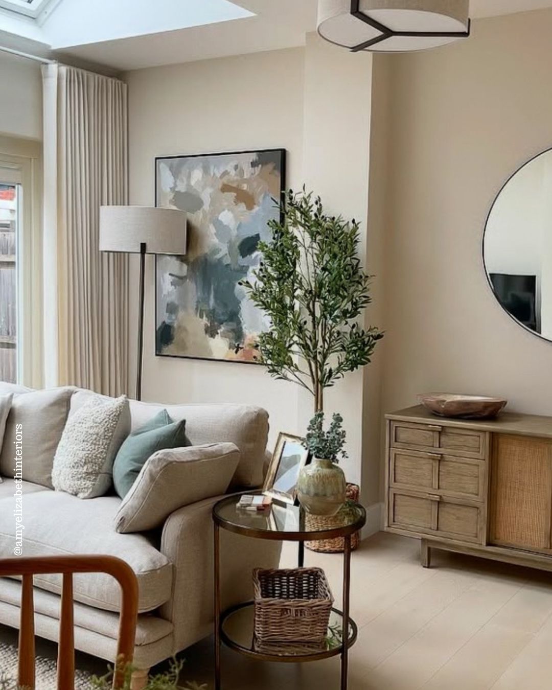
The Colour Chart 2026 by Abstract House.
Why start with colour psychology? Paint sets the emotional temperature of a space long before the first guest arrives, so it's important to set the stage by considering the room colour.
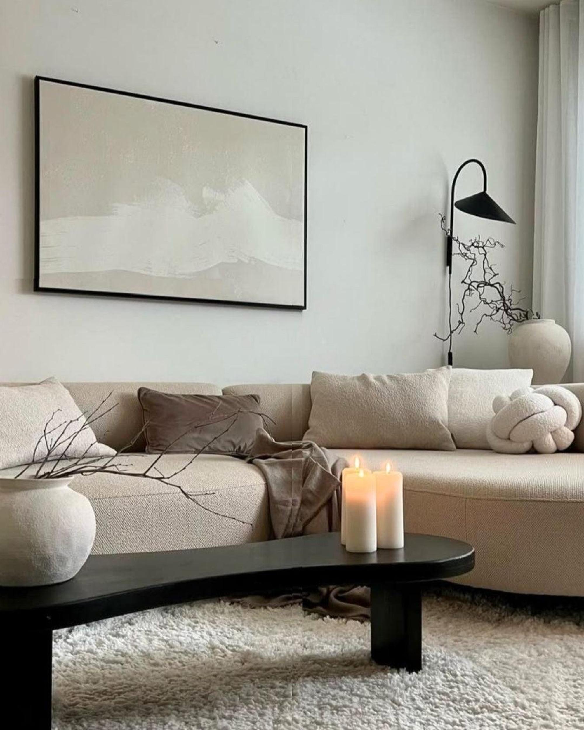
Warm, grounded hues can make a large room feel intimate and welcoming; cooler, airy tones can open up compact spaces and create a sense of calm. Desaturated greens are linked with restoration and focus; mid-tone blues signal composure and trust; clay and terracotta notes evoke craft, heritage and warmth. When you choose wall colours that reflect the mood you want, your artwork takes the centre stage.
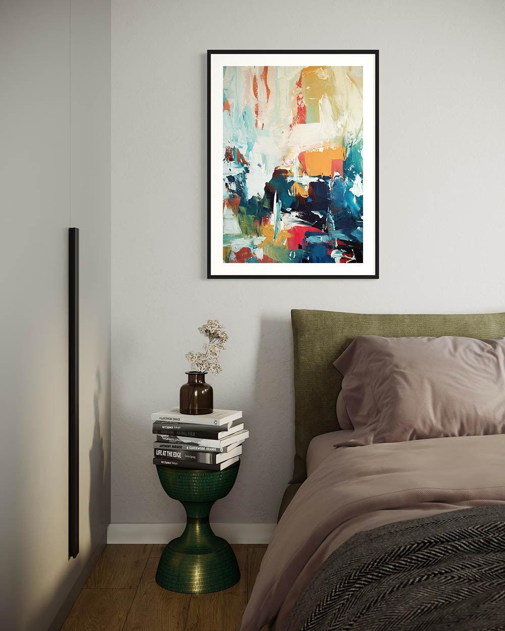
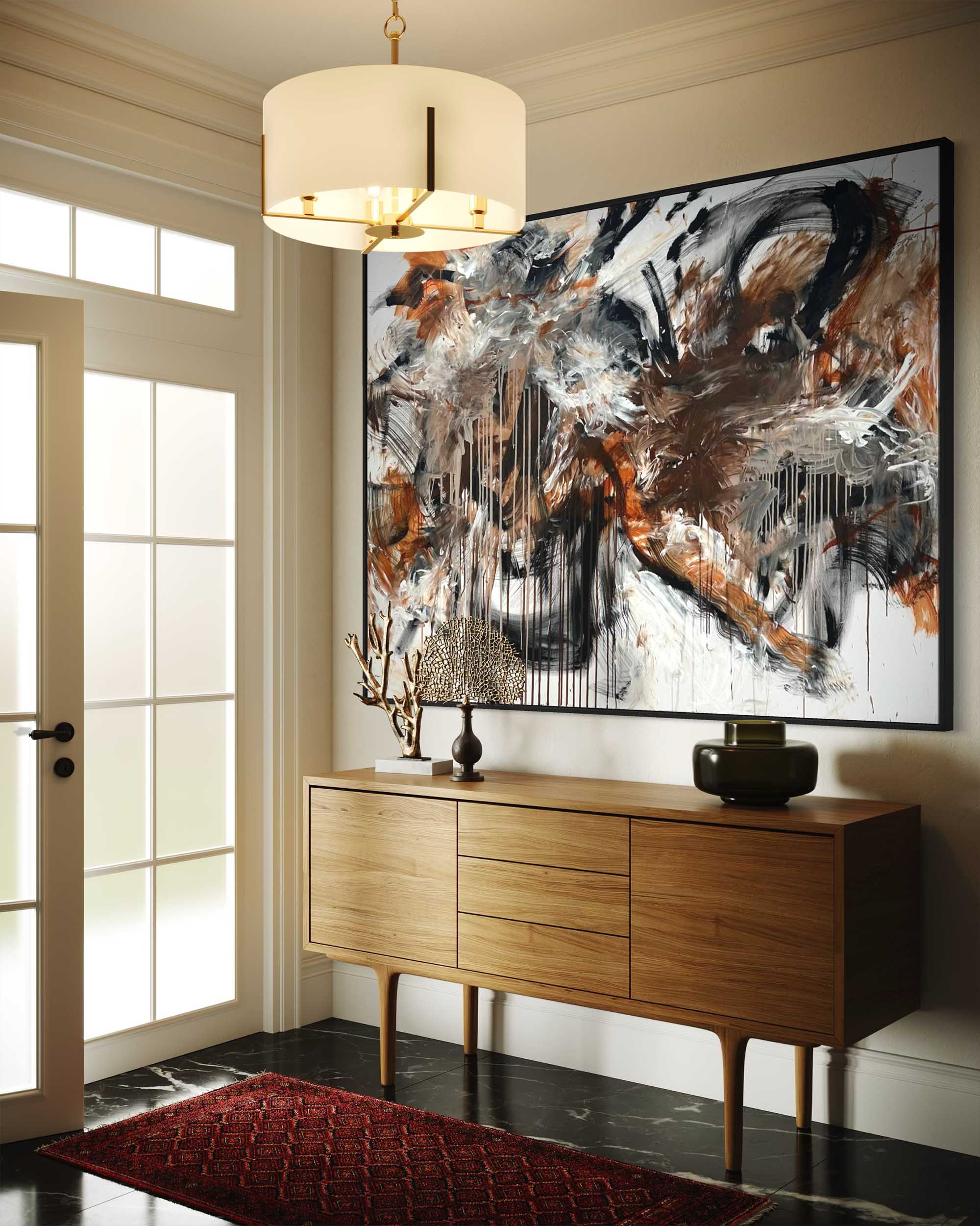
Art and paint should talk to each other. The most successful pairings often come from echoing an artwork’s secondary tones rather than matching its hero colour. Look for undertones—does that “neutral” lean pink, yellow, grey or green? Aligning undertones between paint and print keeps a scheme sophisticated rather than shouty. Consider finish, too: a matt wall beside a textured canvas reads luxurious and gallery-like, while a subtle eggshell can bounce light back onto works on paper.
Light matters as much as pigment: north-facing rooms reward warmer tints; south-facing rooms can handle cooler or deeper shades. Test large swatches around the artwork’s intended position and watch them through the day.
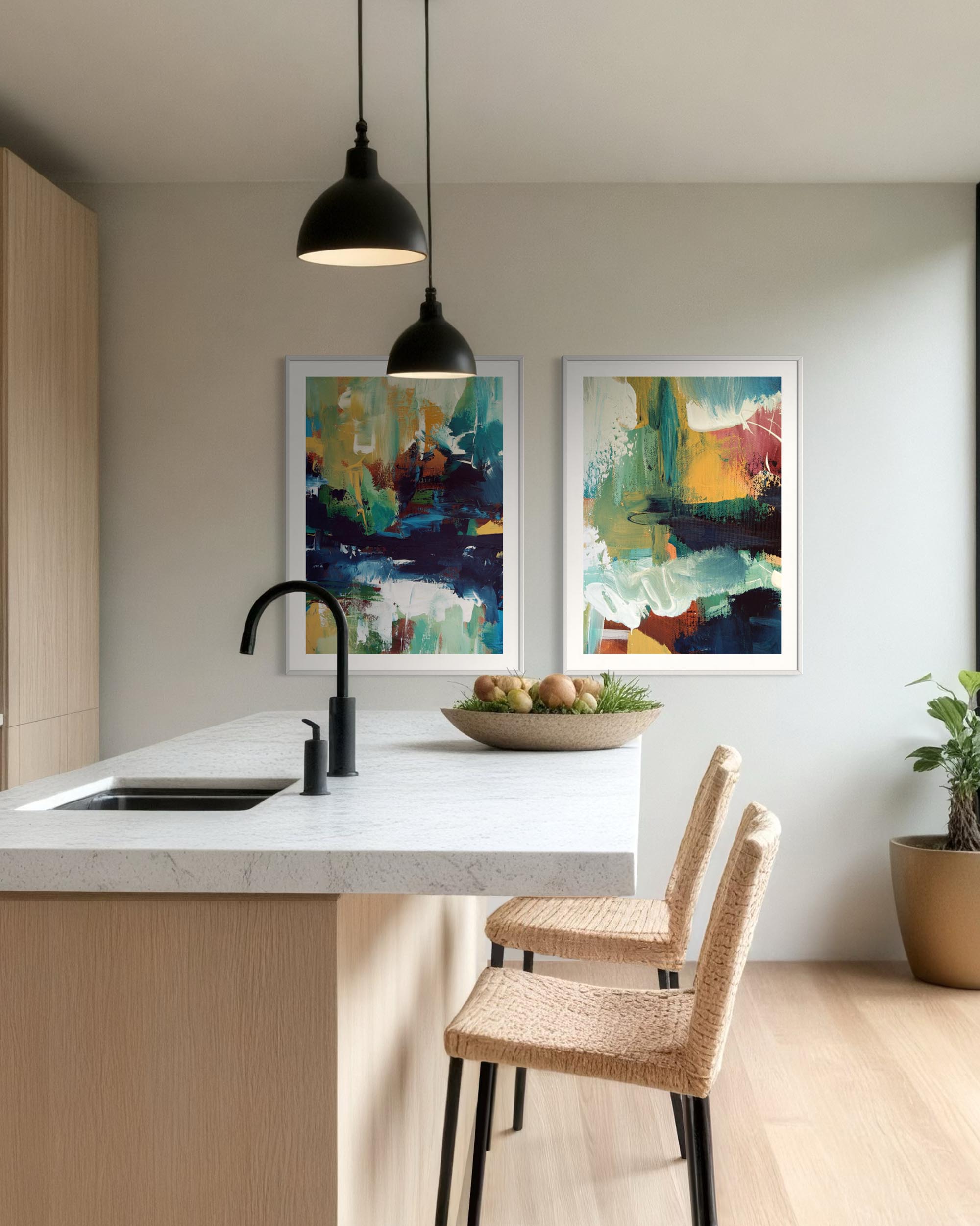
Bringing colour into your home is also an investment in everyday wellbeing. A thoughtful palette supports how you live: softer palettes for bedrooms and studies; optimistic mid-tones for kitchens and dining spaces; richer, cocooning hues for living rooms and snug corners. Colour can also encourage behaviours, such as longer mealtimes together at the table, that instant calm allowing you to unwind faster in the evening, or focus more easily at your desk in your home office. It can even improve how you experience your collection: the right background can sharpen contrast, reveal hidden details and elevate modest pieces to feel museum-ready.
While trends come and go, longevity matters more. Our 2026 selection balances what’s fresh with what’s timeless, so your rooms won’t date by next season. You’ll find versatile bridge colours that link different artworks across an open-plan space, and confident accent shades for those ready to create a dramatic gallery wall. Each recommendation includes suggested pairings from our collection to keep flow consistent.
Use this guide as your palette partner: start with the artwork you love, choose the mood you want, then select a hue that supports both. The result is a home that feels intentional, collected and beautifully you—where colour frames every piece, and every piece feels right at home.